K-T Design System
Cutting MVP timelines from six weeks to two
Creating K-T, a design system for Centene’s internal tools. Its 31 core components and shared patterns gave embedded designers one way to build, saving 200+ design hours a year.
- Design system
- Strategy
- Facilitation
- Team leadership
Impact
One year in: MVPs shipped three times faster across product teams
K-T gave product teams 31 documented components, a shared naming language and a Pattern Library, so they reused proven solutions instead of rebuilding them.
- Speed
- 3xFaster MVPs, from about six weeks to two
- Build time
- -30%Average UI build time across product teams
- Time saved
- 200+Design hours saved each year
Embedded designers moved fast, but their work drifted apart
Our product teams followed a hybrid approach to team formation. This allowed us to run an in-house consulting model, enabling each product designer to embed themselves within other departments and product teams and lead those initiatives.
This structure promoted deep focus on individual initiatives, but as designers operated independently, recurring patterns began to emerge: gaps in alignment, duplicated efforts, and inconsistent design quality across projects.
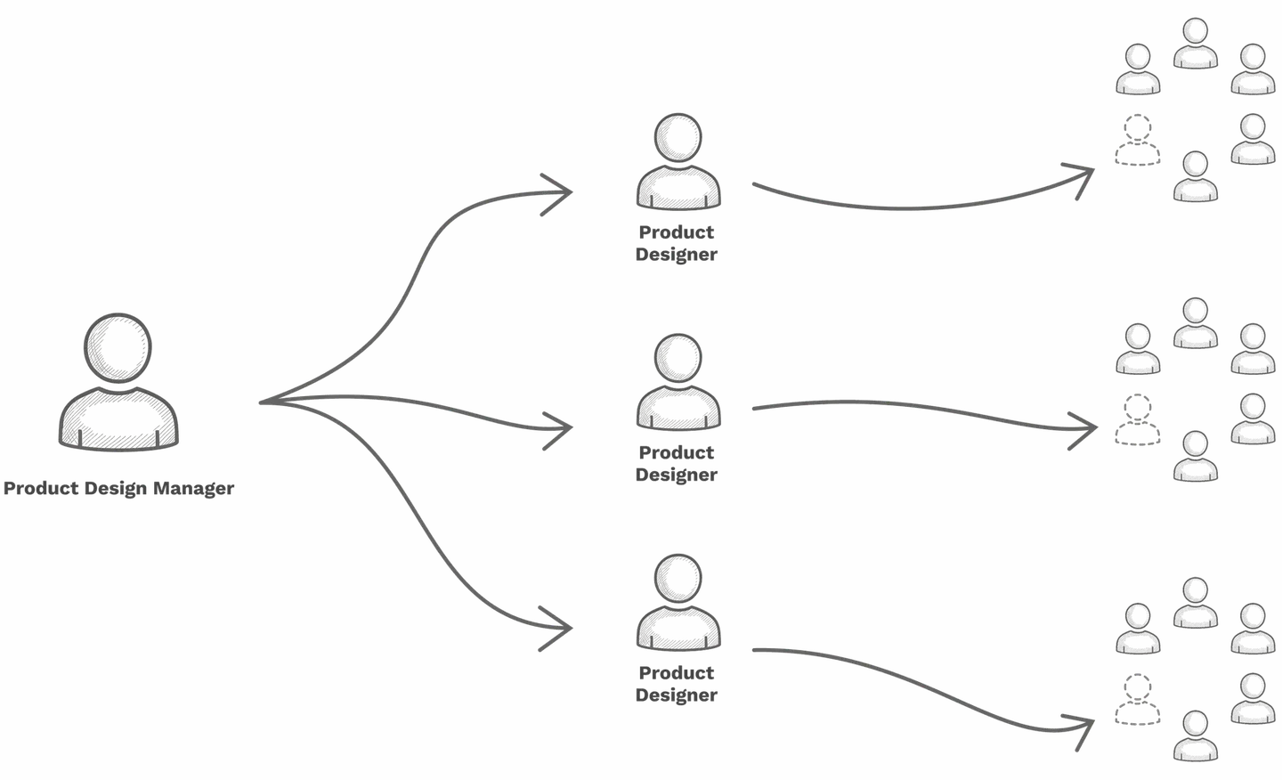
- Product Designer
- Product Designer
- Product Designer
Conflicting patterns were being introduced, leading to inconsistent user experiences and confusion during training.
Slower development cycles resulted from reinventing solutions rather than reusing established ones.
Limited scalability hindered the team's ability to support the organization effectively.
Duplication of effort emerged as different teams solved the same problems in parallel.
These challenges underscored the need for a unified approach to design, one that could balance the benefits of embedded designers with the consistency, efficiency, and scalability of shared practices.
Three existing systems, and none fit our internal teams
Our design teams follow a philosophy of design system agnosticism, choosing whichever system best fits the project and its audience. While this flexibility supports tailored solutions, it has also led to fragmentation, with designers relying on three different systems.
Scale from federated to centralized.

PrimeReact
An open-source, publicly available solution. It offers a wide range of capabilities typical of large federated systems, but its lack of clear opinions on best practices and patterns often limits design cohesion.

Fondue
Our internally developed design system benefits from Centene's scale as the largest provider of Medicare and Medicaid in the U.S. It supports experiences used by one in fifteen Americans. While Fondue is positioned as the future of Centene's customer-facing platforms, it doesn't directly address the needs of our internal design teams.

Transform
Another internal system shows promise but currently lacks the maturity to support multiple platforms and projects at scale.
Adapting a 90-day framework to start with alignment, not components
Starting a design system is more about alignment than it is about components. Using Dan Mall’s Design System in 90 Days framework as a foundation, we reshaped the process to match our culture, pace, and expectations.
This helped us open productive discussions about how to evolve our shared practices: not just starting something new, but strengthen what already existed.
While Dan Mall’s framework gave us a solid starting point, we quickly realized our environment required its own adjustments, especially during the Define Constraints phase. This step helped us clarify who we were designing for, what goals the system needed to achieve, and which values and trade-offs mattered most.
Atomic Design plus tokens gave the system room to scale
Drawing inspiration from Brad Frost’s Atomic Design methodology, we adapted the model to better suit our needs, organizing the system into tokens, atoms, molecules, and organisms.
While tokens aren’t part of Frost’s original framework, introducing them allowed us to further delineate our smallest elements and establish a scalable foundation that could grow with the system.
To accommodate multiple products and platforms, we separated templates and pages from the core design system, housing them in a centralized Commons Library.

Tokens
Tokens are the values needed to construct and maintain a design system, represented as data. They’re used in place of hard-coded values to keep every product experience flexible and unified.
Examples: colors, fonts, shapes, animations, and single images.
Atoms
Atoms are the simplest form of UI elements, objects with physical properties like size, form, and content. Think of them as Legos: the foundational building blocks of an interface.
Examples: buttons, labels, checkboxes, chips, and modals.
Molecules
Molecules are groups of atoms bonded together that take on distinct new properties. They form relatively simple UI elements that work together as a unit.
Examples: menus, buttons with icons, text fields with labels, and navigation.
Organisms
Organisms are relatively complex UI components made of molecules and atoms. Most can function on their own, without relying on other elements on the page.
Examples: tables, galleries, date pickers, and accordions.
At this point, we defined a set of primitives to align color, typography, and spacing, creating a cohesive aesthetic across all system components.
One naming convention gave design and code a shared language
As the project moved into components, we defined a naming convention structure for both design and development.
This structure gave our teams a common language: one source of truth that both designers and developers could rely on. It also laid the groundwork for growth, allowing components to scale seamlessly across products and teams.
| Part | What it means | Button example |
|---|---|---|
| Component | The primary family the component belongs to. | Button |
| Variant | The larger variant change within the component group. | Secondary |
| Action | The action, or change, the UI is meant to perform. | Destructive |
| Size | The size of the component. | Small |
| Type | The layout variation of the component. | Icon only |
| State | The specific state of the component. | Disabled |
An open-sourced icon library was adopted with both filled and outlined versions.
Filled
Outlined
A full product audit found 31 core components worth building
We started with a full audit of our products to understand what we already had, and what we were missing. From that, we identified 31 core components that showed up again and again across our ecosystem. These became the foundation of our design system.
Patterns that existed in only one product were treated differently: stored in the Commons Library as one-off solutions that didn’t require the same level of scalability.
31 Core Components
Identified through a full product audit across the ecosystem
- Accordion
- Alert
- App Bar
- Banner
- Button
- Button Group
- Card
- Checkbox
- Chip
- Datepicker
- Dialog
- Disclosure
- Divider
- Icon Button
- List
- Menu
- Modal
- Navigation Side Drawer
- Pagination
- Progress Indicator
- Radio
- Select
- Slider
- Snackbar
- Tab
- Table
- Tag
- Textfield
- Toggle
- Tooltip
- Tree
For every component we built, we created documentation that explained not just what it was, but how and when to use it. Each page included a description, visual examples, and a breakdown of its states, properties, and variants.
A governance model let the system grow without a bottleneck
As K-T began to take shape, we needed a way to keep it healthy as it grew. We created a governance model: a framework for how the system would evolve, stay consistent, and continue aligning with both product and business goals over time.
Pattern Structure Model
All patterns within the pattern library are designed with the same core structure. This consistency allows us to build patterns with modularity and enables designers to easily manipulate each pattern to their specific needs.
A Pattern Library above the system for shared, data-driven patterns
As our product ecosystem expanded, we started to see the same design patterns appearing in different places, built separately, but serving similar purposes. Atomic Design’s Template stage covers structure, but what teams really cared about was the data each pattern represented.
So we created a Pattern Library, a layer above the Design System, where these shared, data-informed patterns could live and evolve together.
Choosing the right maturity level, because every level adds cost
It’s important to acknowledge that design systems carry ongoing costs, primarily in maintenance, governance, and continued investment. As a system matures, these costs naturally increase.
Each level of maturity offers its own advantages and trade-offs. In most cases, teams should remain at a lower level of maturity until the lack of advancement begins to inhibit progress or scalability.
No System
Bespoke design & code · No reusable concepts
Style Guide
Colors, typography · Styled HTML samples · Bespoke code · Reusable styles
Pattern Library
Shared vocabulary · Lightly documented · External to codebase · Reusable components
Design SystemK-T
Mostly documented · Integrated with codebase · Well maintained · Core part of workflows · Multiple themes
Systemic Organization
Fully transparent & documented · Dedicated team & resourcing plans · Fully governed & integrated in process · One system · AI and automation
K-T in practice: patterns shipped across multiple products
The following examples highlight patterns developed using K-T, illustrating the system’s flexibility and real-world implementation across multiple products.
A system is only as useful as the teams it serves
I’ve built component libraries before, but K-T was the first time I had to convince an organization to use one. The hardest work wasn’t the tokens or the components. It was the conversations: aligning on what we owned together, what each team kept on its own, and how a system could grow without becoming a tax on the people building inside it.
A design system doesn’t solve fragmentation by existing. It solves it by being adopted, and adoption is a craft of its own. K-T didn’t end the trade-offs between speed and consistency, but it gave the teams a shared place to make those trade-offs out loud. That alone changed how we worked.
