It’s not often I’m able to play a game and be absolutely stunned by the visuals. Child Of Light surpassed every expectation of aesthetics and managed to do it without sacrificing anything else to achieve it. While I’m not typically an RPG fan, the mechanics, interface, and structure made this game just as brilliant to play as it was to watch.
Below is an analysis of certain elements from the game for those, like me, who were inspired by its beauty. Feel free to email me if you have any resources that you’d like to add to the list.
Typography
Dante MT
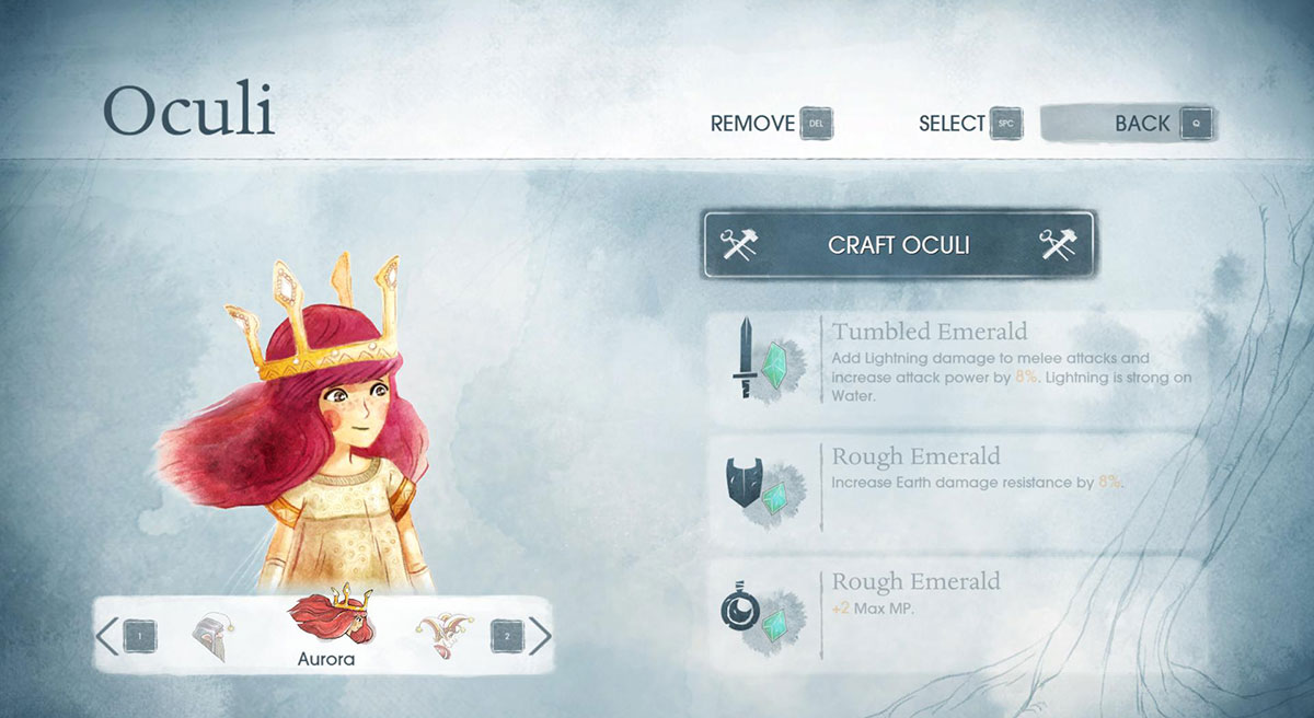
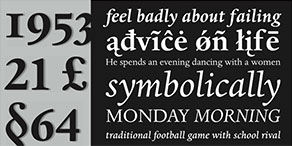 The serif font is Dante MT and is used for the games main headers. Dante was designed by Giovanni Mardersteig and was originally used by Officina Bodoni as a typeface for books. The name comes from the book Trattatello in Laude di Dante which was the novel in which the font was first used. The font was also designed to keep a respective balance between both italic and roman, however as far as I can tell, Child Of Light doesn’t actually use Dante for italic anywhere.
For those looking for a cheaper option consider using Centaur as it’s Adobe created and comes with your Adobe software so you’ll already have it installed!
ITC Avant Garde
 The san-serif font used is ITC Avant Garde, another Adobe font, and is based off the logo of the magazine Avant Garde. We’ve all seen logos with great typefaces only to realize it’s custom (like the Child Of Light logo) but two designers, Herb Lubalin and Tom Carnase, decided to go the extra mile and actually build it. This one, unfortunately, doesn’t come with any Adobe software and puts you back a good amount if you’re looking for the entire family. DIN Neuzeit Grotesk looks just as nice if you’ve already got access to that one. With that said, the simple Century Gothic is still quite similar and most likely comes with your OS.
Lubalin later went on to create an offshoot called ITC Lubalin Graph, a slab-serif version of ITC Avant Garde.

Textures
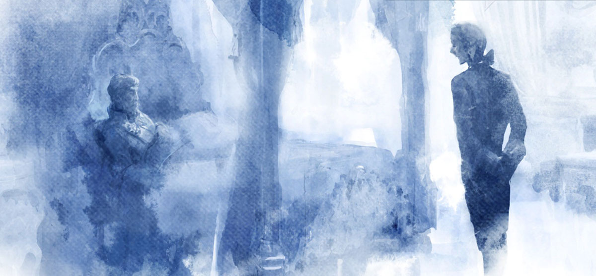
With the water color styled painting one must also notice the water color paper texturing. Below are three different links to different water color textures; the first two being free to download.
Watercolor in Photoshop
Because Child Of Light uses multiple layers to achieve it’s parallax effect and has minor uses of transparency we can be pretty sure the artwork was digitally painted rather usual ink on paper. Could you imagine painting this entire game each layer at a time to then scan it and cut it out? I can’t even imagine how much time and effort that would take.
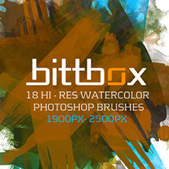
Good Photoshop brushes can be hard to come by. The first two are high resolution brushes and the third has a vast assortment of various sizes.
Since the installment of Photoshop CS6, Photoshop now comes with several paint brush tools built in that can be fully utilized to digitally paint a watercolor themed painting. While some of them work with a mouse it’s highly suggested one use a stylus to maximize the tools Photoshop is able to provide like modifying your stroke based on the angle of your pen. Very cool!
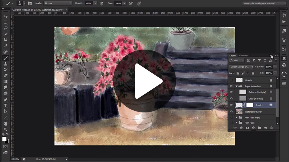
Robert Ardill has an online course that walks you through how one can utilize Photoshop in such a fashion. Below is a link to a playlist but it’s not for the faint of heart. He takes his teaching role seriously but it seems learning the skills takes a bit of time.
Color Palette
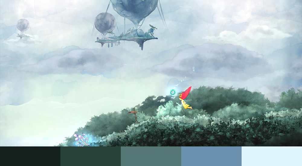
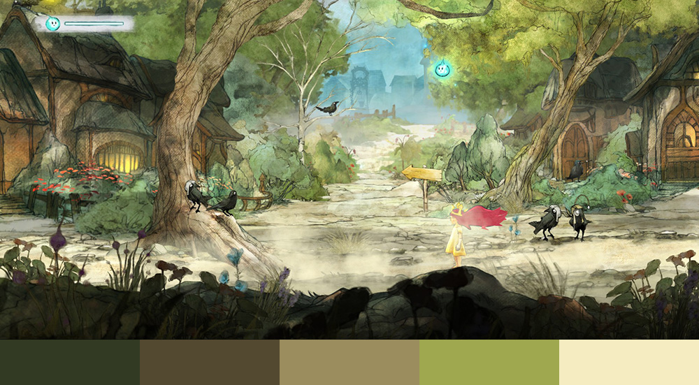
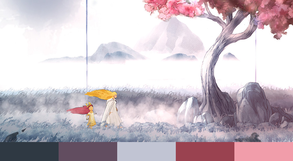
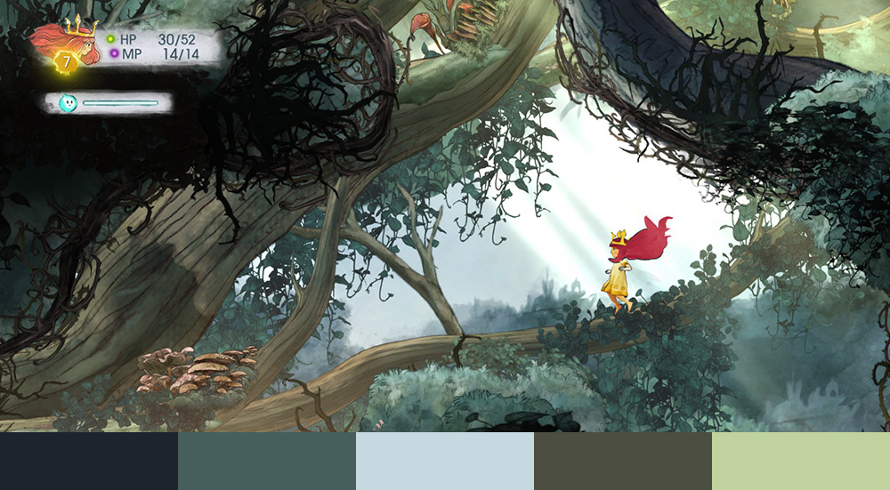
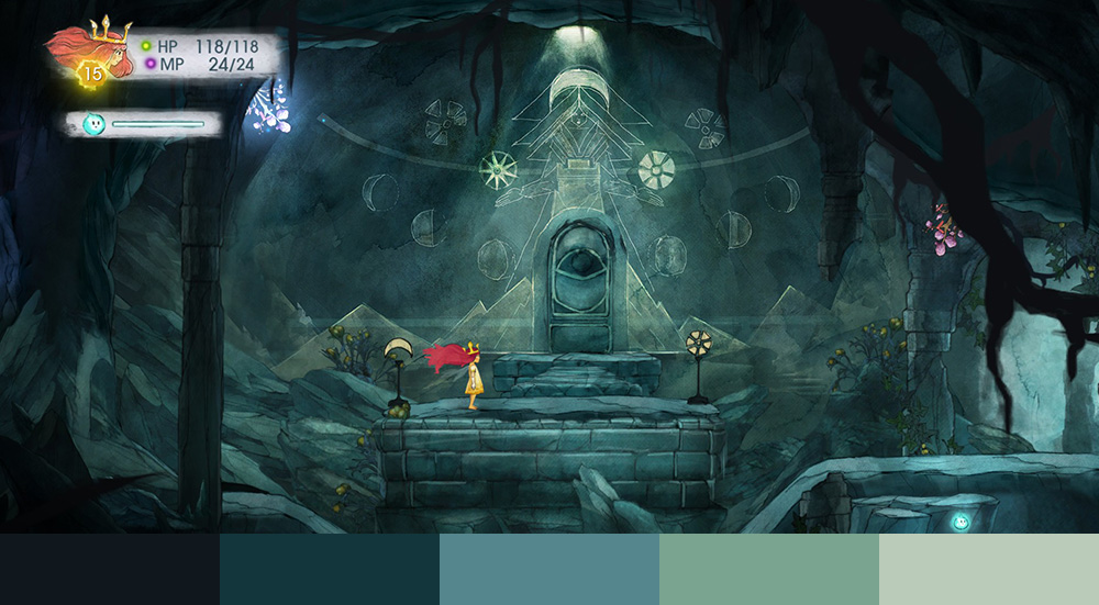
Despite the hundred or so screenshots I took throughout my play, the color palette stayed very similar. While the brightness and hue changed somewhat regularly the saturation level averaged out to only about 30%-35%. Perhaps this is natural for the water color style but even the stylish and more graphical effects placed upon things like magic during battles stayed within these same constraints. It seems muted colors are a very definite and purposeful theme to this game.
It’s also occurring to me now that I look at the color palette that there weren’t a lot of “happy” scenes in the game. Even when roaming the forests and grassy plains things took a much more dry and brown look rather than going with something more bright and joyful. I suppose the storyline doesn’t elude to a happier plot to begin with but for being a dream the world stays quite cold indeed. I hope all of her nights aren’t like this.
Music
 The music was composed by Coeur de Pirate (Pirate Heart), a solo brand by the Canadian writer Béatrice Martin. While she’s won many awards for her career as a performer this was her first composition album and, in my opinion, by far her most talented. Jeffry Yohalem, the writer of Child Of Light, mentions that Béatrice only had concept art to work with when composing her pieces.
“We usually work with external composers, as we did with Coeur de Pirate on Child of Light. When we began the project we pitched the story to her and described the game. She jumped on board, then we divided the game into zones or levels and requested a piece of music for each. Concept art was provided as well as a description of the feel. In AAA games, videos of cutscenes or specific emotional moments in-progress are provided for sequences requiring unique orchestral moments, but we didn’t do that with Child of Light, since we are a smaller, more intimate game.” —Jeffry Yohalem in his Reddit AMA
If you haven’t played the game but are interested in the soundtrack you can check out this youtube playlist that walks you through the entire thing. Absolutely recommended if you haven’t heard it!
You can also watch this video on the making of the soundtrack.
Related Artists
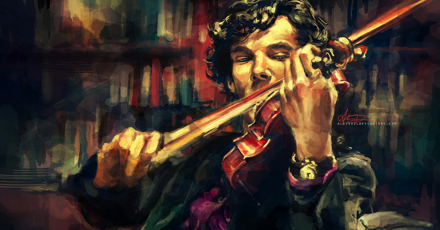
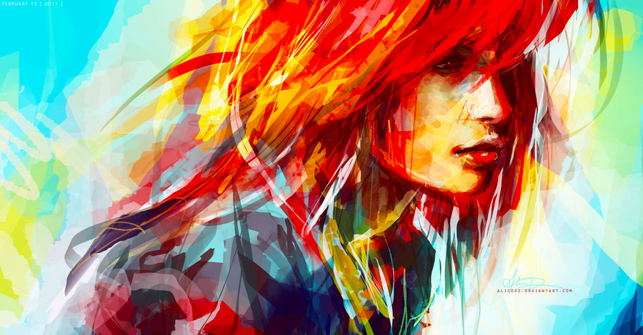
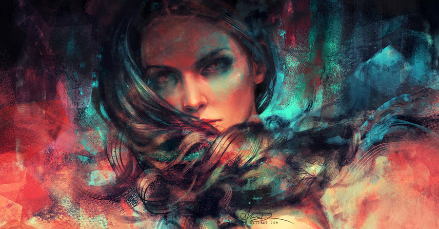
While playing this game I couldn’t help but think of the artist Alice X. Zhang. Some of her work is quite a bit different than the style from Child Of Light but most of it has the same digital watercolor feel. Below are a few examples be absolutely check out her portfolio on either her website or her deviant art page. Her work is absolutely stunning!
Conclusion
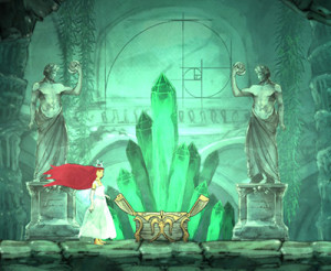 Overall this game was amazingly well done and loved every second of the experience. This is one of those few games I wish I could go back in time and allow myself to become emersed in once again. There are so many beautiful subtleties throughout the game like the use of foreground objects creating parallax or hiding Fibonacci in a secret room. It makes me wonder how many I ended up missing because I never found them or simply didn’t notice.
If there’s something I haven’t listed send me an email and I’d be happy to add it in!
Also Check Out: Superbrothers: Sword & Sworcery Design Analysis


