Short Writings
Sprint Schedule Outline
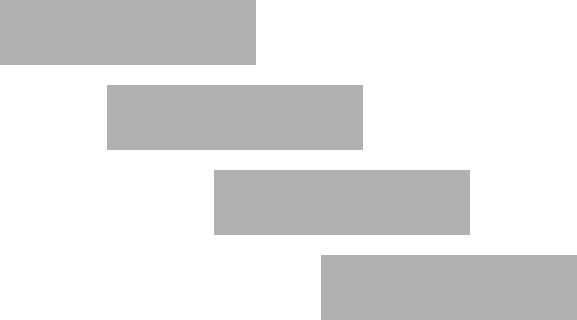
The development of a mature agile workflow varies depending on the unique characteristics of each project. Every team faces distinct requirements, challenges, and communication needs that must be addressed. However, as the agile philosophy emphasizes specific user roles, there are certain similarities in the communication patterns among these roles. Moreover, given that most agile teams operate in two-week sprints, there are commonalities in the timelines and level of effort required in each iteration.
At Centene, we employ a process called Slicing for our design-to-delivery handoff, yet the fundamental structure of a UX designer’s work during the sprint remains consistent. Backlog prioritization, the ‘Design, Build, Test’ workflow, and effective communication with all stakeholders for approvals are all essential components of each iteration. At a high level, this timeline can serve as a useful framework for ensuring a successful sprint.
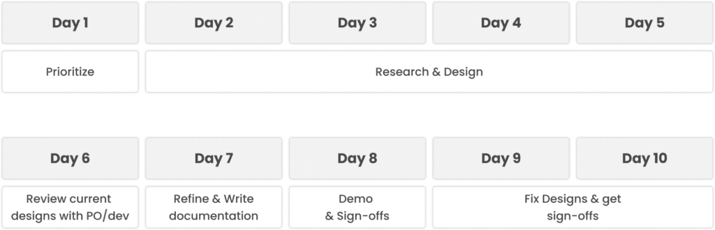
- Day 1: Prioritize hypotheses and the potential features you’d like to validate and design for that sprint.
- Day 2-5: Research hypotheses with users, product owners, and other stakeholders. Build ‘80% Satisfaction’ mockups.
- Day 6: Review current mockups with Product Owners and Developers to validate course and feasibility while also informing the team of upcoming efforts.
- Day 7: Refine mockups based on Product Owner and Developer feedback. Write documentation for the new designs.
- Day 8: Demo the new designs with all stakeholders. Walk them through new features and what problems you’re attempting to solve for this iteration. Ideally, get sign-offs.
- Day 9-10: Fix the items that were discovered in the Day 8 demo. If needed, follow up with specific stakeholders to validate redesigns.
As mentioned earlier, each team is unique. This schedule should work as a base outline that any UX designer can augment to better suit their individual and team needs.
Principles Have Sacrifices
At a previous job, there was a sign posted on the breakroom wall that displayed three core principles. The company in question was a bank and the sign was not just in this breakroom but in the breakrooms of every branch and facility under the brand’s umbrella. In big, bold text it read, “Ownership, Accountability, Responsibility.”
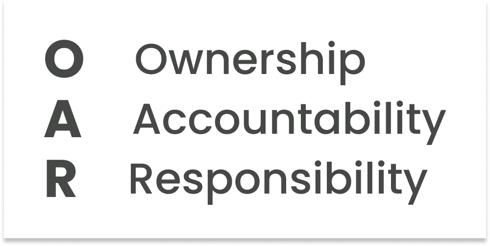
There are a few things about these signs I didn’t appreciate—not the least of which was a cubical jungle attempting to remind me about the fundamentals of being a good person. That said, there’s a simpler problem: these aren’t principles. As far as I can tell, they’re not even values. It’s just a list of nouns.
Many companies fall under the trap of having missions, visions, and principles that end up being design-by-committee word clouds—probably the very pitfall of the above. Words like “accountability” and “responsibility” are generically kind terms that every company would like applied to them. They’re not unique and they don’t provide differentiation of any kind. While there is plenty of literature that describes what a principle is and how to write one, there’s one easy trick to remember: principles have sacrifices.
Instead, consider a word like “traditional”. A “traditional” bank could value in-person transactions and tailor to an older audience. Rather than focus on a fancy website or automation, they focus on relationships and individual needs, two amazing benefits. However, “traditional” comes at the cost of potentially not being up to date with the latest technology and most likely reliance on manual processes. It has sacrifice.
And that sacrifice is exactly what makes that principle strong. It’s something to boast about and a reason for being different.
80% Is Good Enough
In a famous quote, Bill Gates once opined, “I choose a lazy person to do a hard job because a lazy person will find an easy way to do it.” While some may disagree with this approach to problem-solving, it touches upon a core principle of UX design that every UX designer should embrace.
The Agile methodology emphasizes the importance of a minimum viable product (MVP) in validating a direction by obtaining the maximum amount of information with the least effort. In essence, the goal is to be as efficient as possible – a philosophy that resonates with many of us. For UX designers, this is a familiar concept, as each Agile sprint is geared towards achieving just the right level of functionality to launch a product. However, I believe that we can take this principle one step further.

I advocate for striving for 80% satisfaction on any project or task, as this threshold is generally good enough for most purposes. Suppose you spend ten hours working on a project and attain 80% satisfaction. Pursuing a 90% satisfaction level may require an additional five hours of work, while achieving 95% satisfaction could require ten extra hours. In such scenarios, it takes a considerable amount of effort to gain only a modest increase in satisfaction.
The main issue with this is that 80% satisfaction is often good enough to move on to the next project, where the value provided may be more significant. While it may not be perfect, reaching the 80% mark is often the cue to transfer the ticket to the “Review” column and shift focus to the next task at hand.
Choosing The Right Research Tactic
Selecting the appropriate research methodology for a given situation need not be as complicated as some resources make it out to be. Although there are numerous articles that explain when specific tactics should be employed, I have yet to come across a resource that provides an impartial approach regardless of context. By focusing on the objectives of the researcher, we can effectively and objectively identify the most suitable research method for any given situation.
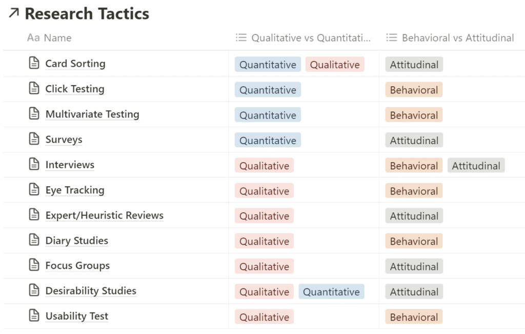
For those unfamiliar with the terminology, let us briefly define the following filters:
- Qualitative: Measured by the quality.
- Quantitative: Measured by the quantity.
- Behavioral: How people act.
- Attitudinal: How people feel.
When faced with a situation where additional research is required, ask yourself two fundamental questions:
- Do I require a few high-quality results or many low-quality results?
- Do I want to understand how people behave or how people feel?
Once these two questions have been addressed, it will be possible to objectively narrow down the potential research methodologies for the given scenario.
Paid Education Is A Solution To Time
All UX designers know that education is paramount to succeeding in this industry. The technical world moves fast and if we don’t keep up, more skilled designers using advanced tools like AI will outdate the need for their previous generation.
Education that is either free or cheap is amazing. Online resources like Google, youtube, or community boards like Reddit (if you can withstand the barrage of negativity) are invaluable for learning. Buying used books off Amazon has an incredible amount of value to dollar while also acting as a trophy when you’re finished reading (and if you don’t adopt that used book, who will?).
All that said, paid education has two major and often overlooked benefits:
- It’s fast. Finding a free, high-quality resource can be challenging.
- It’s comprehensive. Paid resources have curriculums and fill the entire gamut of knowledge.
If the goal is to learn as much as possible in the shortest possible time, paid education is superior. And in my experience, the return on investment is well demonstratable.
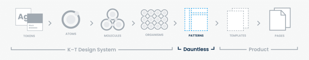
Building Modular Systems
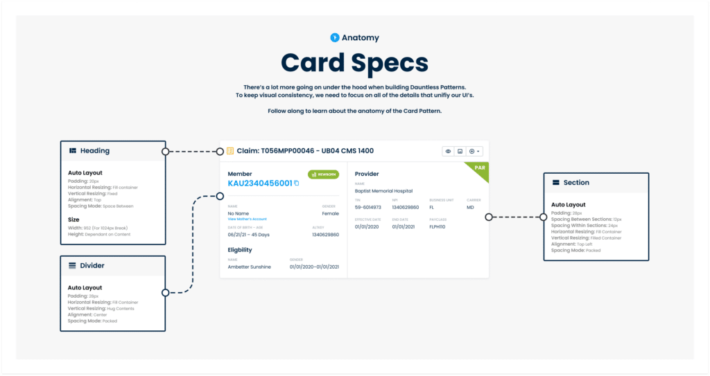
As my team’s design system and pattern library mature, we continue our efforts to maintain scalability while still enabling our resources to be easily consumable. However, with system scalability comes sacrifice—flexibility typically being one of them. In the case below, I believe I was able to provide a scalable solution without any sacrifices by designing patterns with modularity.
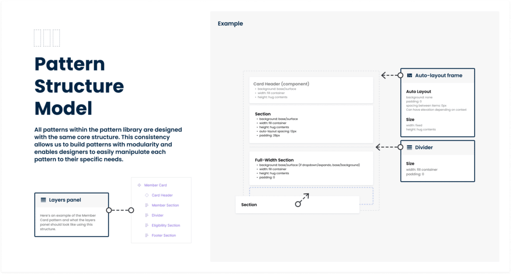
For the pattern library to be successful, our designers should feel empowered to not only pull any designs from the library but also feel capable of manipulating each pattern as necessary. This objective required two things:
- Patterns have to be designed in a similar fashion. Learning the structure of one design should enable a designer to learn the structure of all designs.
- Patterns should be easily editable to specific needs.
Thanks to Figma’s auto-layout features, I was able to build each pattern with identical core structures. Each piece of the structure worked separately and—similar to a design system—can act as a building block.
Above is the logic describing how each pattern is built. Not only does this maintain flexibility with all our patterns, it even enables our users to use the framework as a drag-and-drop interface with each section.
Growth Is A Staircase
One of my biggest drivers in life is the constant strive to be better. I love learning, academia, and challenging what makes me uncomfortable. One of my lifelong goals is to build a library—a goal that Google informs me is achieved by owning a minimum of 1,000 books. And despite all this, it took me more time than I care to admit that the mental model of how I thought growth worked was wrong.
I had always thought growth looked like a constant slope. The more I read, the more slope I climbed, slowly inching closer toward an infinite tip. But if this was true, what did I sometimes feel stagnant? Why did my effort only seem to make an impact… sometimes?
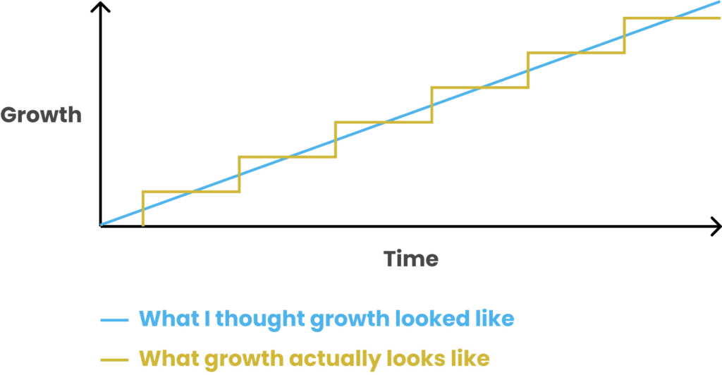
Turns out, growth is more like a staircase. Sometimes you read a book and you don’t gain anything from it. Other times, you make an incite, gain a new skill, or change an outlook. And as long as you keep growing, it’s ok to sometimes feel stagnant. You’re just getting closer to another step.
Why Every Journey Map Looks Different
I struggle with the term ‘journey map’ because it means so many different things. A journey map could measure the emotional state of a user as they use a product. A journey map could also show the different types of users involved in the process, the location of the user during a process, or any number of other attributes that could be associated with the product. It means too many things.
So when I’m asked by new designers what a journey map is and what the objective of building them is, I walk them through this mindset.
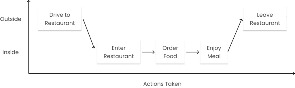
At their core, a journey map is simply a list of steps in the order those steps are taken. In the example below, we have a journey map of someone driving to a restaurant to eat a meal.

Something that’s easily missed, however, is that these steps could easily be placed on a graph. Because we’re moving horizontally, we’ve already defined our vertical axis. Now all we have to do is define our horizontal axis.
For the horizontal axis, you could really choose anything. Common examples include the enjoyment of the user, things the user might be thinking, or different states the user is in. For example, here’s what this journey map might look like using the same restaurant example from above and adding a horizontal axis that describes where the user is.
At the end of the day, journey maps typically follow the same format. The vertical axis is the steps being taken while the horizontal axis is whatever the designer is attempting to measure.
Do AI-Generated Personas Outdate Proto Personas?
There are three types of Personas: Qualitative Personas, Statistical Personas, and Proto Personas. I’ve talked about all of these before but at a high level, Qualitative Personas are built from Interviews. Statistical Personas are built from analytics, and Proto Personas are built from guesses. Qualitative Personas have been considered the status quo for many years but as the industry transitions into agile, Proto Personas are seeing more use. That said, the need for having personas of any kind is dwindling.
If we were to place each person on a graph of factualness vs the time it takes to make and understand, we get a graph like the one below.
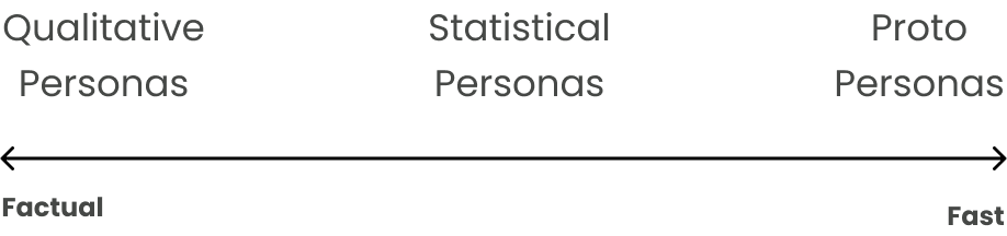
And then ChatGPT came out and AI-Generated Personas came along.
Frankly, I don’t know where to put it. They’re definitely faster to make than Proto Personas but with the assumption the information on them is accurate, they may also be more factual. While I’m not a huge fan of the philosophy of personas, I’m forced to ask if AI-Generated Personas outdate Proto Personas and become the better solution. I genuinely don’t know.
Color Contrast: The Accessibility Trap
As accessibility becomes of larger importance to organizations, designers find themselves learning more about the ADA and how it affects our digital products. In this discovery, designers find themselves researching all the regulations within the Web Content Accessibility Guidelines (WCAG) and how to follow the rules they provide. Of these rules, color contrast is not just one of the most popular, it’s also where the most time is wasted.
The first thing to mention is that a lot of WCAG is tricky. Many of the rules in the document are hard to validate and others are just plain hard to understand. Color contrast is neither of these. It’s objective, quick to validate, and easily noticeable. Unfortunately, it doesn’t provide much value.
There are several reasons for this but let’s talk about the main two.
Firstly, most people who identify as disabled don’t struggle with color. Even when color contrast isn’t great and violates the ratio WCAG recommends, it’s still usually usable. Those with sight are still typically able to make things work and those without sight don’t care. Furthermore, it’s not unusual for a product to choose to disregard color contrast with a mindset of solving the problem in another way. Apple, for example, doesn’t have enough contrast on its disabled buttons. Rather than changing the contrast, they’ve chosen to provide error messaging explaining why the button isn’t functional.
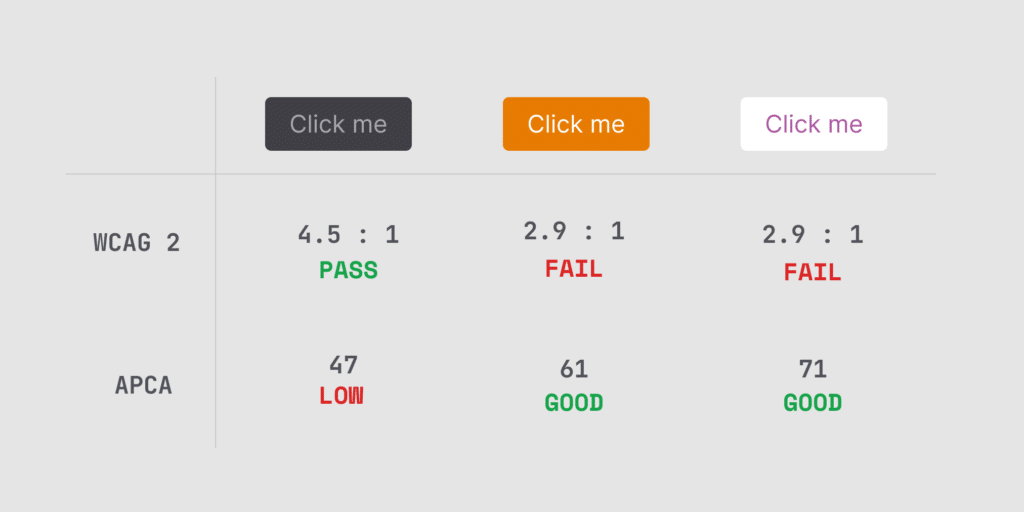
Secondly, W3C—the organization that maintains and updates WCAG—has stated the measurement used to calculate contrast is flawed. The current process biases certain colors of others and misrepresents which contrasts are legible verses which aren’t. W3C has stated a new calculation will be in future versions of WCA.
I love that accessibility is getting more highly prioritized. If you’re a designer new to accessibility, don’t fall under the color contrast trap. Do what you think is good enough and move on to more important rules.
Pattern Library: The Older Sibling Of A Design System
At Centene, we work in a decentralized environment where each UX designer leads their own product team. Each designer is building their own products, solving their own problems, and pulling from the same design system. However, with a decentralized environment comes hurdles in consistency between products and how certain problems are solved. At Centene, we were witnessing multiple teams solving the same problems without realizing their efforts were redundant with one another. This is how we solved the problem.
Let’s say Team 1 is working on a product and they need to add a scheduling feature to the application. Because the scheduling feature is complex, it can be built using pieces from the design system, however, is too complex to be stored in the design system itself. Meanwhile, Team 2 is attempting to solve the same problem and doesn’t realize Team 1 is already building a solution.
The first problem that needs solving is the ability for Team 2 to be informed on the things that Team 1 is working on. We solved this with a more formalized design studio. In this meeting, our designers walk each other through what they’re currently working on and how they’re solving that problem.
The second problem that needs solving is a single, solitary place to store these features. For that, we created what we call a Pattern Library. Similar to a design system, large features can be stored here, modified for individual team usage, and pulled from. And because it’s stored within Figma, all teams have visibility to it and are able to contribute.
Typeface Stress Testing
At Centene, I have the pleasure of working on a fairly mature design system. It’s well established between the core members of our team and has already been validated through many projects and their outputted products.
However, Centene is a large company with many other departments, some of which having design systems of their own. The growth between our departments has gotten to the point where we’ll likely be forced to join forces and merge three or so design systems into one.
This process will undergo many challenges, of course, but there’s one in particular that’s bothering me in my inability to stay objective: choosing the right typeface. I certainly have a personal favorite but that mindset isn’t strong enough to warrant its own defense.
Instead, I’ve attempted to solve this conundrum in another way: find the various portions of our applications where unique typographic data exists, display them in a single place, and see which typeface handles those situations most effectively.
However, I can’t help but feel there has to be some shortlist that assists in stress testing a typeface agnostic of my specific environment. Surely there’s some application that displays all the typical hurdles like O’s looking like 0’s and I’s looking like 1’s, right?
I googled, I binged, I asked my network, and nothing was found. I even asked Reddit and battled the negativity of the internet.
If anybody finds a solution to this, please let me know. I have a hard time believing this is a problem that hasn’t already been solved.
Corporations Don’t Enable Design Sprints
Like most UX designers, reading through the book Design Sprint by Jake Knapp was an inspiring look into how a lean, agile workforce could be done. I aligned with the philosophy of constant iteration and the ability to unite a team into a single focus for each sprint of effort. I even convinced the company I was working with at the time to pay for a $1,500 masterclass for me to attend to better learn how to teach and run design sprints at my 9-5.
Unfortunately, the conclusion I came to is that we couldn’t do it.
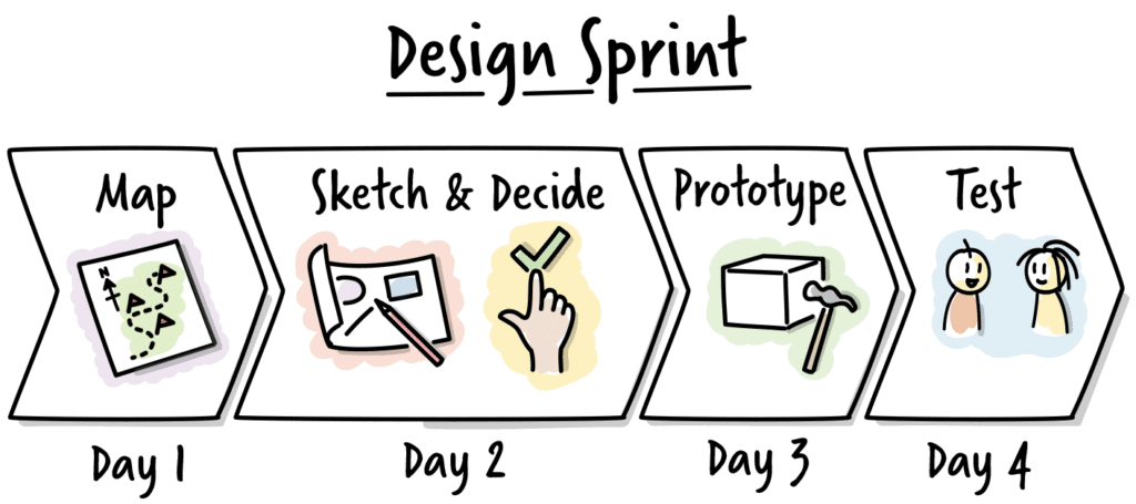
The biggest hurdle with the Design Sprint methodology is that the workflow is micro-managed. It takes the willingness of the organization to allow 5-7 people to free their calendars for an entire week to focus on a specific problem. These team members won’t be able to attend their usual meetings or answer their emails in a timely fashion.
Long story short, the philosophy of a design sprint can’t go from the bottom up. It has to already have the buy-in from relevant stakeholders or it won’t happen. And while some tactics from the design sprint can absolutely be incorporated into a designer’s workflow, corporate environments are too great a friction point for a Design Sprint to make sense.
UX Question Ordering
Doctors have an order in which they ask questions and diagnose a patient. To example this, let’s say someone is visiting their doctor due to having some pain in their knee.
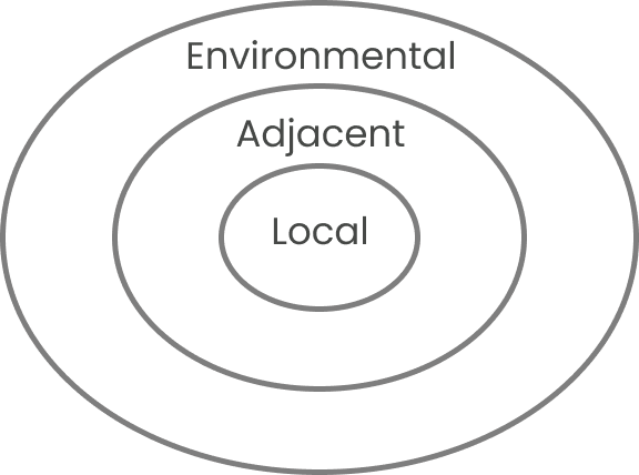
The first steps begin with direct relevancy to the spot in question. Questions asked might include, “Does it hurt when you bend it?” or “Where specifically is the pain?” along with checking the area to verify any discoloration or swelling.
The second steps graduate one circle more board and might include discovery of when the problem occurred, if they can put weight on it, and how long the issue has been affecting them.
The third steps graduate even further out and often involve lifestyle. This discovery could include environmental factors, patient history, or even family history.
By diagnosing patients in this particular structure, doctors can be confident they’ve hit all the core fundamentals and have clear context of the problem theyr’e attempting to solve.
To circle this metaphor back to UX design, I find those with the most senior thinking typically work in the opposite manner. They start at the largest circle and graduate inward. They typically start with questions regarding the problem being solved and the context of that problem before diving into the specifics.
I’m inspired by the structure doctors use and would love to take a deeper dive into building a similar structure into my workflow.
Accessibility: A Solution To Lawsuits
When a company begins looking into accessibility, there are typically two conversations they’re looking to have. The first conversation is what it takes to genuinely be accessible. How long it takes, how it works, and what’s the cost. However, then there’s the second question—the question that’s at the back of everyone’s mind and an awkward conversation to have:
What do I need to do to prevent being sued?
If we take a look at the WCAG ruleset, we find that some of them are objective, measurable requirements. Color contrast, for example. One can take the color of the foreground, the color of the background, and plug it into a computer and see the result. It will either conform to the regulated color contrast ratio or it won’t.
Then there are rules that are softer and don’t necessarily have simple answers. Things like links being tabbed through in a predictable order or alt tags providing accurate descriptions. Validating if these things follow WCAG’s ruleset currently still requires human intervention.
If we were to gauge how much of WCAG is objective, I’d estimate that number is somewhere around 20-30%. Not a lot. And from this, we can gain a couple of interesting incites.
The main method of those who are suing organizations for not being ADA compliant is to utilize web crawlers to discover these sites. Web crawlers are robots and are objective in their processing. Therefore, resolving just that 20-30% of objective rules will likely be all that’s needed to prevent lawsuits.
Secondly, a UX designer should now feel more enabled to better sell the necessity of accessibility to decision-makers. While doing the minimum isn’t ideal, it still does an immense amount of good for those with disabilities and is a great place to start the conversation.
Four UX Questions For Feedback.
Whenever I’m in a position where I’m expected to provide UX feedback, I will typically start the conversation with the same four questions:
- What problem are you trying to solve?
- What stage of the process are you currently in?
- What kind of feedback are you looking for?
- How are you measuring success?
Asking these questions—particularly in this order—has several key benefits. They enable feedback to stay focused and relevant, context to the problem one is trying to solve, and a better understanding of the direction the designer is intending to head.
Job Search Priorities
There are three priorities I have when searching for a new position:
- Societal benefit. Does the company provide a benefit to the world and meet my expectations of ethics and morality?
- Culture. Will I fit well within the culture of the organization and will my local department match my personality and interests? Will my co-workers challenge me and enable me to grow as a person?
- Product. Is the product of interest to me and something I see myself focusing on for the next 3-5 years?
I should mention that while these priorities work well for me, I’m in a privileged state of my career where I no longer have to prioritize items like salary. If I were earlier in my career and struggling to meet financial means, salary would make the top three if not sit at number one.
My career is also focused on corporate environments where things like stress is rarely a factor. If I were to pivot and dive back into the structure of a design firm, I’d be reprioritizing mental health and work hours while being cautious about what job descriptions refer to as “fast-paced environments”.
When To Upgrade Tactics: A Musical Metaphor.
In musical theatre, there’s a general philosophy about when and why a performer decides to sing and like UX design, it’s all about communication. When a performer becomes too excited to speak, they sing. When they get too excited to sing, they dance. Their level of communication heightens to meet their level of expression because the previous was holding them back.
As UX designers, we have similar obstacles in how we communicate. When words aren’t effective, we user flow. When user flows aren’t effective, we wireframe. When wireframes aren’t effective, we low/high fidelity.
The objective of wireframes is either concept validation or communicating with others on your team. For concept validation, drawing works great for quick idea germination. For communicating with others, I upgrade to wireframes only when user flows hold me back. Both these processes should be fast and ugly.
Personas Are A Dated Tactic
Personas are often used to represent the characteristics, needs, and goals of target users. There are three main types of personas: qualitative, statistical, and proto-personas. While personas have been widely used in UX design, there is a growing trend toward questioning their necessity.
Qualitative personas are based on direct interaction with users. They require time-consuming interviews and observation to create. Statistical personas, on the other hand, rely on analytics and demographic data to construct. While they can be created quickly, they may not provide a complete picture of the user. Proto-personas are the most speculative type of persona, relying on assumptions and guesses rather than data.
Proto-personas, which were once dismissed as unreliable, have gained popularity in the agile era. They allow for rapid iteration and quick adaptation to new information. By relying on the best guesses of the design team, proto-personas can be developed quickly without the need for extensive user research. However, if we look at the overall need for building personas, the problem of better understanding users is now typically solved with faster iteration and constant discovery.
The agile philosophy has played a major role in the declining popularity of personas. Agile teams tend to be smaller and more specific, with a single UX designer on each team. This makes the use of personas less relevant, as communication and collaboration within smaller teams can be more streamlined. Additionally, the fast-paced nature of agile development prioritizes building and testing quickly over the accuracy and quality of results.
With faster iteration comes faster discovery. With faster discovery, personas no longer add much value.
CEOs Don’t Want Scalability. They Want Increased Velocity.
Enterprises consistently prioritize system thinking, placing particular emphasis on the capacity to scale their products and solutions. This poses challenges for UX designers including the limited number of designers available to maintain pace, the ability to cope with growing technical debt, and the ongoing hurdles of a maturing team.
In reality, scalability is not the ultimate goal. No one wakes up in the morning thinking, “I aspire to be more scalable.” What they’re truly after is increased velocity.
Interestingly, the term ‘Scalability’ is hard to define. We know why we want it—we want to go faster and grow. We know how it works—systems are designed with the ability to be repeatable. But what actually is it? What are the key elements that make something scalable?
Let’s delve into how a UX designer incorporates design thinking into their process of constructing a scalable system.
System Processes
- Choose a design application (e.g. Figma, Sketch).
- Start a component Library—stay away from a design system until not having one holds you back.
- Understand that everything you build right now will come with technical debt and that’s ok.
Communication
- Begin transitioning your component library into a design system.
- Understand how to apply Atomic Design’s philosophy into your system.
- Create design system documentation.
- Potentially build a 1-to-1 system with your codebase (something like Storybook helps).
Maintenance
- Create a designated design system team for maintenance. They will maintain the system when new brand standards occur, your design application comes out with new features, and when accessibility standards change.
- Create maintenance documentation
- Create a governance model
Team Structure/Culture
- Schedule Design Ops with your team (i.e. weekly, monthly).
- Schedule Design Studio to review team designs.
- Create onboarding documentation.
- Develop a centralized knowledge base.
Composability
- Potentially create a commons library per product that uses the design system.
- Create a pattern library for all products that use your design system.
All of these features should enable a UX design team to increase their velocity and scale to the needs of any organization.
Onboarding Template
No matter how many times a new team member is onboarded, it seems to always feel like improvements can be made or the goal posts have shifted. While the template below is specific to UX design, the larger points can be utilized across industries.
At a high level, this is a list of items that should be reviewed during the onboarding process. This flow is recommended as it presents the largest points first and slowly moves inward to an individual’s specific role. This flow enables a new employee to understand how their role fits within the larger organization.
- Who we are. Mission, vision, company, local department, and any more specific groups like Design Guild.
- Team. Organizational charts, direct coworkers, stakeholders, and partners they’ll be working closely with.
- Company tools. How to record time, where to learn more, how to use the intranet, where to find the things you need to find.
- Design tools. What tools do you use, design systems, design principles, pattern libraries, and design philosophies and structures like Atomic Design.
- Design implementation. What’s the team process look like, how to sign-offs occur, when do design studios or ops occur, what is expected of a UX designer in the context of the team.
- Project specific. What’s the project you’re attempting to build, what are the problems being solved, and where are you within the process.
Every team is different and every company has a different flow. At a high level, this should provide an outline for one to use and augment.
Classic UX Is Waterfall
I went to Springboard and was taught a fairly classic structure for how UX is done:
Research > Personas > Affinity Mapping > User flow > Wireframe > Low fidelity mockup > High fidelity mockup > Prototype > test.
The hurdle with this structure is it falls fairly well in line with a waterfall mindset. All these things have a motivation of getting it right on the first try. They all take lots of effort and time. As the world moves into a more agile mindset, the narrative of these processes has evolved into, “ok, do all that but faster and iteratively.” Naturally, it doesn’t work like that.
Instead, a truly agile team is going to know they’re getting it wrong with every release. Each sprint has a touch of ‘fixing the last sprint’ with a dash of ‘adding something new this sprint’.
Instead of the flow Springboard teaches, an agile flow looks like this:
Research > Design > Test.
While the process is less structured, the approach of constant iteration makes more sense and bypasses the need for many of the previous tools. Personas no longer matter because we constantly test with users to validate our designs. User flows no longer matter because there’s no need to map out the entire application at once now that we’re starting small, adding on to it every sprint, and rearranging when needed. Wireframes don’t matter because the layout likely changes with every iteration, anyway.
By constantly iterating, we achieve the same objective as the larger flow more quickly and with less effort.