As accessibility becomes of larger importance to organizations, designers find themselves learning more about the ADA and how it affects our digital products. In this discovery, designers find themselves researching all the regulations within the Web Content Accessibility Guidelines (WCAG) and how to follow the rules they provide. Of these rules, color contrast is not just one of the most popular, it’s also where the most time is wasted.
The first thing to mention is that a lot of WCAG is tricky. Many of the rules in the document are hard to validate and others are just plain hard to understand. Color contrast is neither of these. It’s objective, quick to validate, and easily noticeable. Unfortunately, it doesn’t provide much value.
There are several reasons for this but let’s talk about the main two.
Firstly, most people who identify as disabled don’t struggle with color. Even when color contrast isn’t great and violates the ratio WCAG recommends, it’s still usually usable. Those with sight are still typically able to make things work and those without sight don’t care. Furthermore, it’s not unusual for a product to choose to disregard color contrast with a mindset of solving the problem in another way. Apple, for example, doesn’t have enough contrast on its disabled buttons. Rather than changing the contrast, they’ve chosen to provide error messaging explaining why the button isn’t functional.
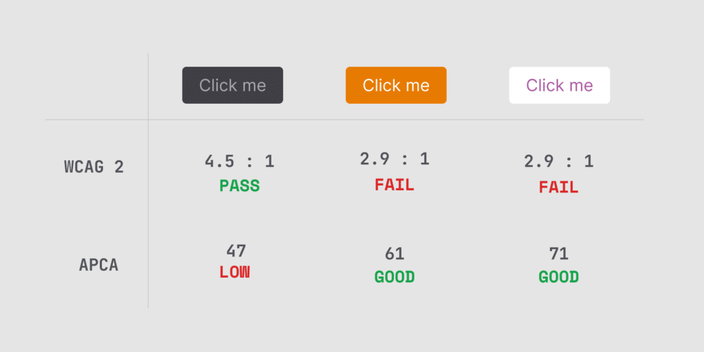
Secondly, W3C—the organization that maintains and updates WCAG—has stated the measurement used to calculate contrast is flawed. The current process biases certain colors of others and misrepresents which contrasts are legible verses which aren’t. W3C has stated a new calculation will be in future versions of WCA.
I love that accessibility is getting more highly prioritized. If you’re a designer new to accessibility, don’t fall under the color contrast trap. Do what you think is good enough and move on to more important rules.