At Centene, I have the pleasure of working on a fairly mature design system. It’s well established between the core members of our team and has already been validated through many projects and their outputted products.
However, Centene is a large company with many other departments, some of which having design systems of their own. The growth between our departments has gotten to the point where we’ll likely be forced to join forces and merge three or so design systems into one.
This process will undergo many challenges, of course, but there’s one in particular that’s bothering me in my inability to stay objective: choosing the right typeface. I certainly have a personal favorite but that mindset isn’t strong enough to warrant its own defense.
Instead, I’ve attempted to solve this conundrum in another way: find the various portions of our applications where unique typographic data exists, display them in a single place, and see which typeface handles those situations most effectively.
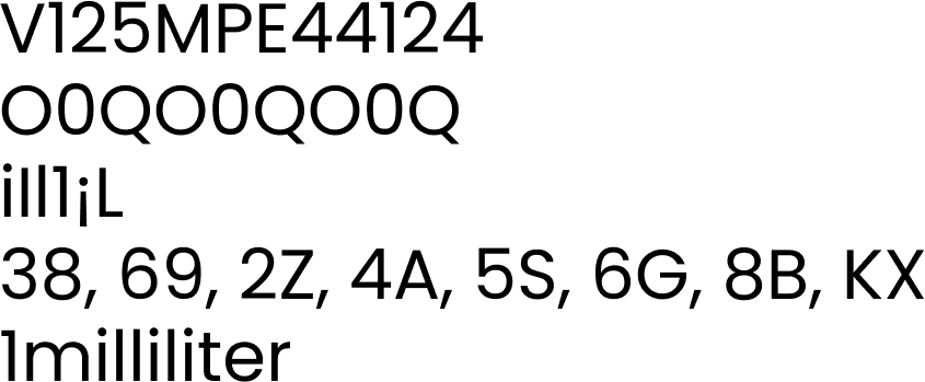
However, I can’t help but feel there has to be some shortlist that assists in stress testing a typeface agnostic of my specific environment. Surely there’s some application that displays all the typical hurdles like O’s looking like 0’s and I’s looking like 1’s, right?
I googled, I binged, I asked my network, and nothing was found. I even asked Reddit and battled the negativity of the internet.
If anybody finds a solution to this, please let me know. I have a hard time believing this is a problem that hasn’t already been solved.