I struggle with the term ‘journey map’ because it means so many different things. A journey map could measure the emotional state of a user as they use a product. A journey map could also show the different types of users involved in the process, the location of the user during a process, or any number of other attributes that could be associated with the product. It means too many things.
So when I’m asked by new designers what a journey map is and what the objective of building them is, I walk them through this mindset.
At their core, a journey map is simply a list of steps in the order those steps are taken. In the example below, we have a journey map of someone driving to a restaurant to eat a meal.

Something that’s easily missed, however, is that these steps could easily be placed on a graph. Because we’re moving horizontally, we’ve already defined our vertical axis. Now all we have to do is define our horizontal axis.
For the horizontal axis, you could really choose anything. Common examples include the enjoyment of the user, things the user might be thinking, or different states the user is in. For example, here’s what this journey map might look like using the same restaurant example from above and adding a horizontal axis that describes where the user is.
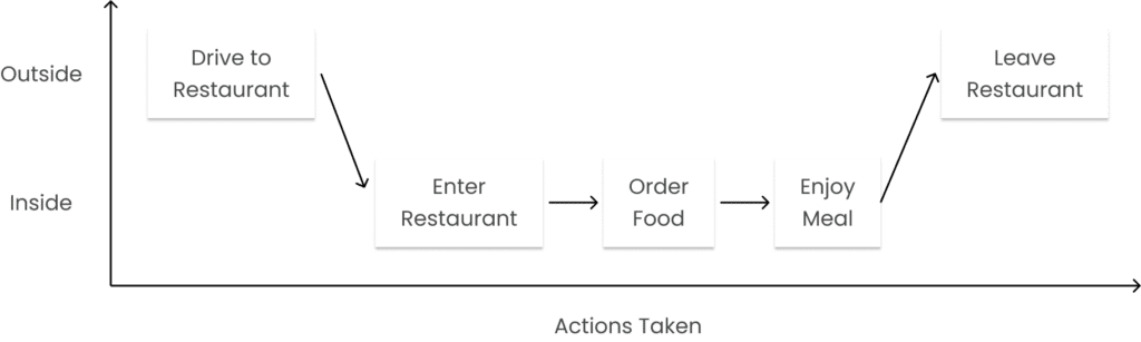
At the end of the day, journey maps typically follow the same format. The vertical axis is the steps being taken while the horizontal axis is whatever the designer is attempting to measure.