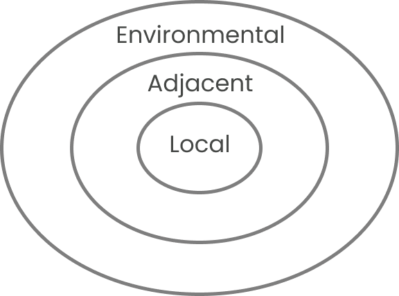
Doctors have an order in which they ask questions and diagnose a patient. To example this, let’s say someone is visiting their doctor due to having some pain in their knee.

The first steps begin with direct relevancy to the spot in question. Questions asked might include, “Does it hurt when you bend it?” or “Where specifically is the pain?” along with checking the area to verify any discoloration or swelling.
The second steps graduate one circle more board and might include discovery of when the problem occurred, if they can put weight on it, and how long the issue has been affecting them.
The third steps graduate even further out and often involve lifestyle. This discovery could include environmental factors, patient history, or even family history.
By diagnosing patients in this particular structure, doctors can be confident they’ve hit all the core fundamentals and have clear context of the problem theyr’e attempting to solve.
To circle this metaphor back to UX design, I find those with the most senior thinking typically work in the opposite manner. They start at the largest circle and graduate inward. They typically start with questions regarding the problem being solved and the context of that problem before diving into the specifics.
I’m inspired by the structure doctors use and would love to take a deeper dive into building a similar structure into my workflow.
