K-T Design System
Designing Systems At Scale
Lead Product Designer
Web App
Hybrid Product Team
Agile, Scrum
1 year
Who is Centene?
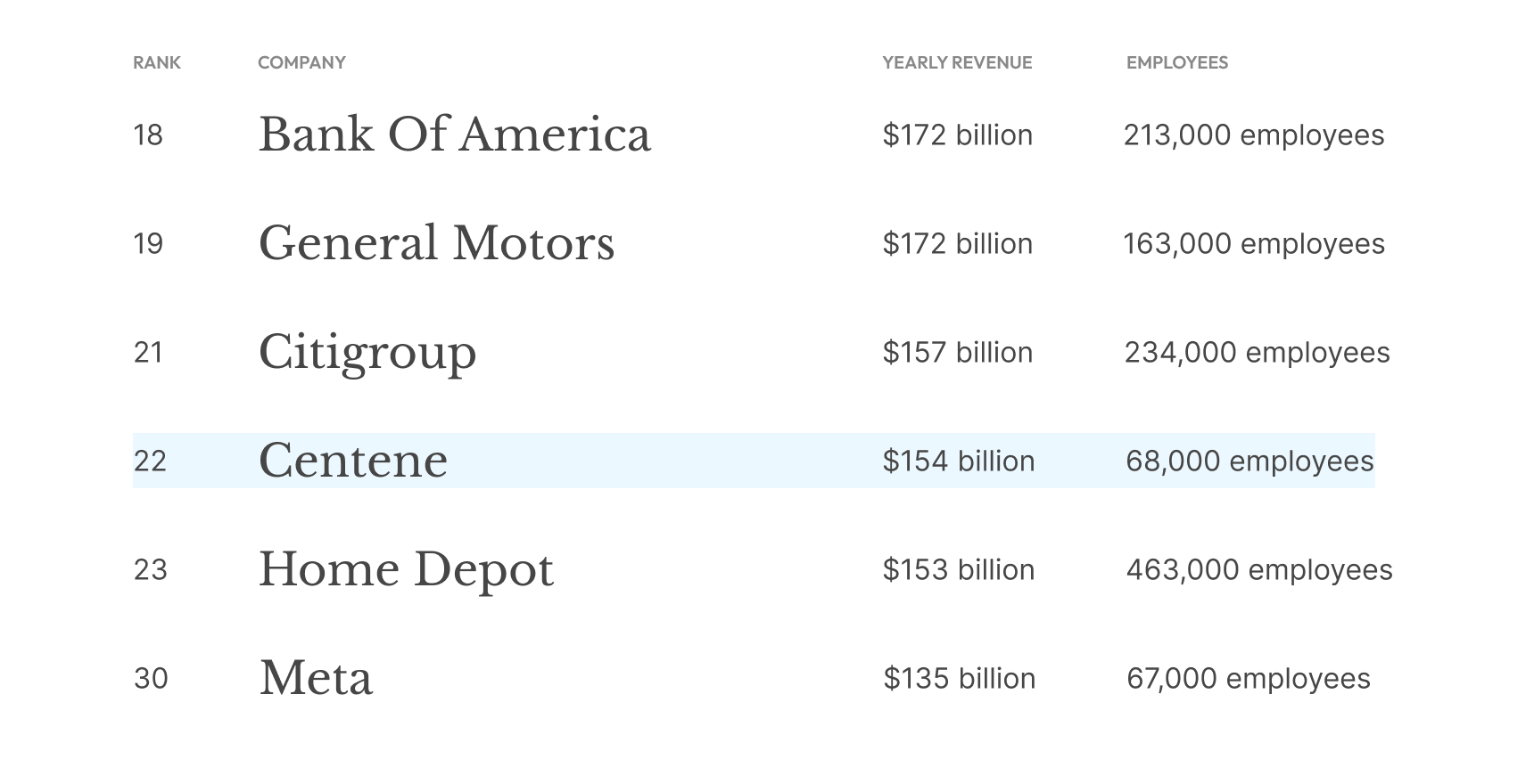
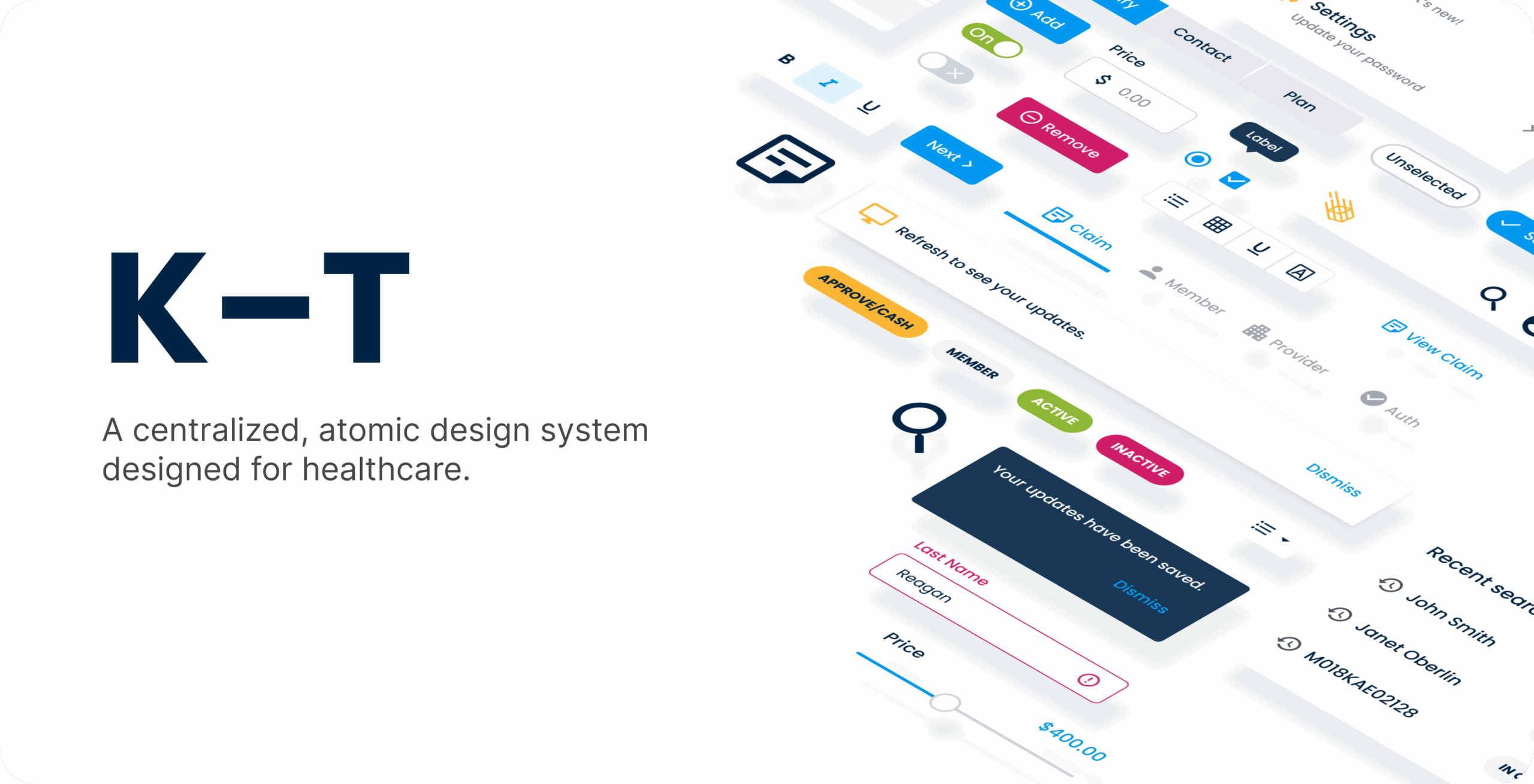
Centene Corporation is a leading healthcare enterprise specializing in government-sponsored and commercial healthcare programs, including Medicaid, Medicare, and marketplace insurance plans. As of writing this, Centene is listed as number 22 on Fortune 500 with 68,000+ employees.
The Problem
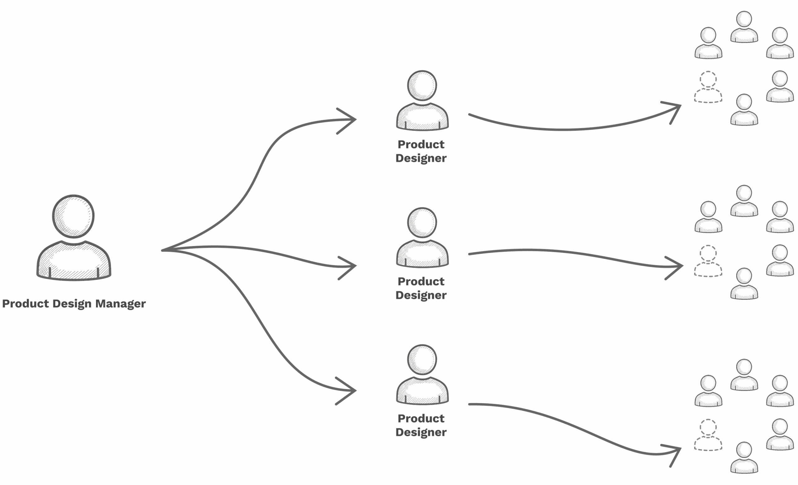
Our product teams followed a hybrid approach to team formation. This allowed us to run an in-house consulting model, enabling each product designer to embed themselves within other departments and product teams and lead those initiatives.
Our hybrid setup placed product designers directly within project teams across the organization. This structure promoted deep focus on individual initiatives but also surfaced new challenges.
As designers operated independently, recurring patterns began to emerge — gaps in alignment, duplicated efforts, and inconsistent design quality across projects.
Conflicting patterns were being introduced, leading to inconsistent user experiences and confusion during training.
Limited scalability hindered the team’s ability to support the organization effectively.
Slower development cycles resulted from reinventing solutions rather than reusing established ones.
Duplication of effort emerged as different teams solved the same problems in parallel.
These challenges underscored the need for a unified approach to design, one that could balance the benefits of embedded designers with the consistency, efficiency, and scalability of shared practices.
The Goal
Develop a unified design system that aligns patterns and practices across the organization — accelerating development, minimizing duplication, and delivering consistent, intuitive user experiences.
What kind of System?
Our design teams follow a philosophy of design system agnosticism — choosing whichever system best fits the project and its audience. While this flexibility supports tailored solutions, it has also led to fragmentation, with designers relying on three different systems.
PrimeReact is an open-source, publicly available solution. It offers a wide range of capabilities typical of large federated systems, but its lack of clear opinions on best practices and patterns often limits design cohesion.
Fondue, our internally developed design system, benefits from Centene’s scale as the largest provider of Medicare and Medicaid in the U.S. It supports experiences used by one in fifteen Americans. While Fondue is positioned as the future of Centene’s customer-facing platforms, it doesn’t directly address the needs of our internal design teams.
Transform, another internal system, shows promise but currently lacks the maturity to support multiple platforms and projects at scale.
Building a new system
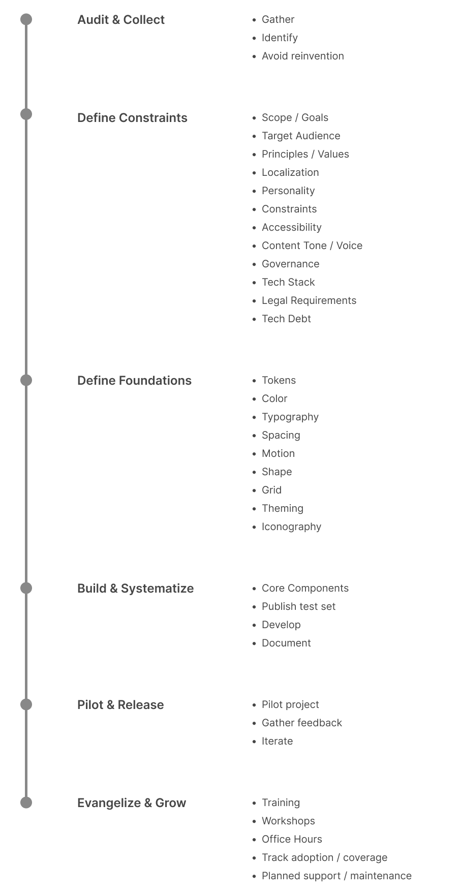
Starting a design system is more about alignment than it is about components. Using Dan Mall’s Design System in 90 Days framework as a foundation, we reshaped the process to match our culture, pace, and expectations.
This helped us open productive discussions about how to evolve our shared practices — not just start something new, but strengthen what already existed.
Atomic principles
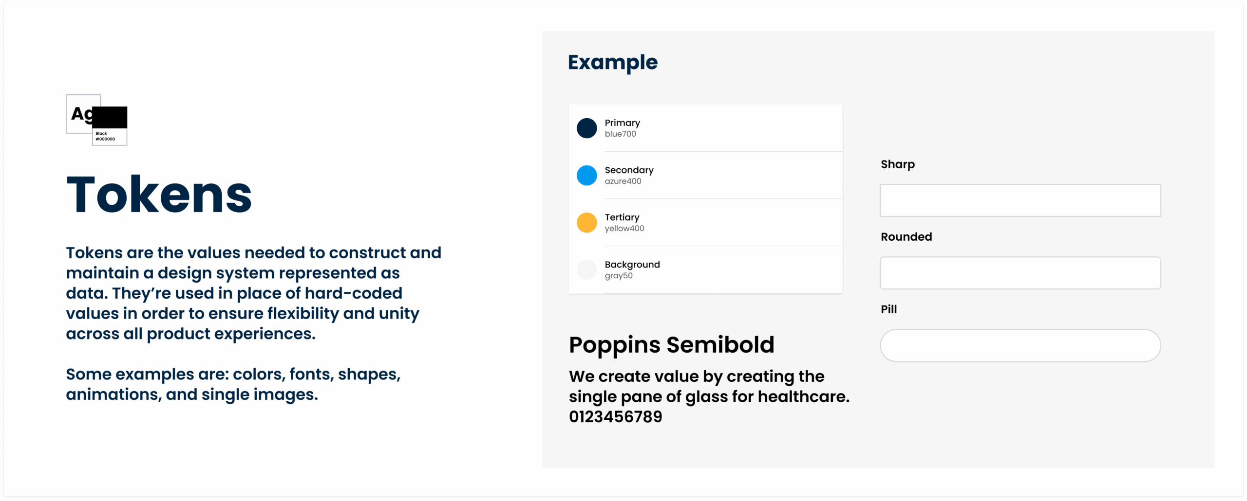
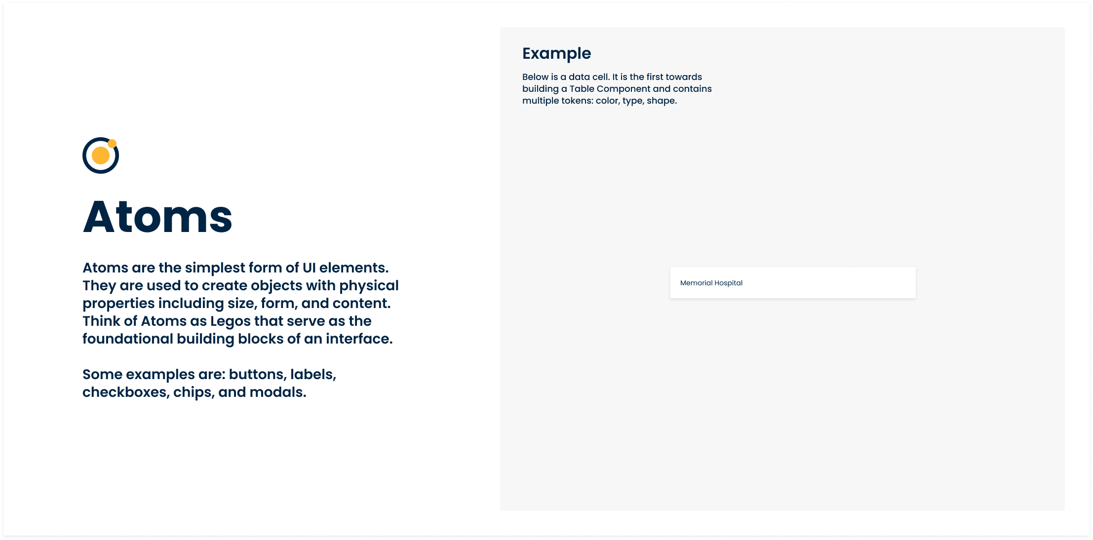
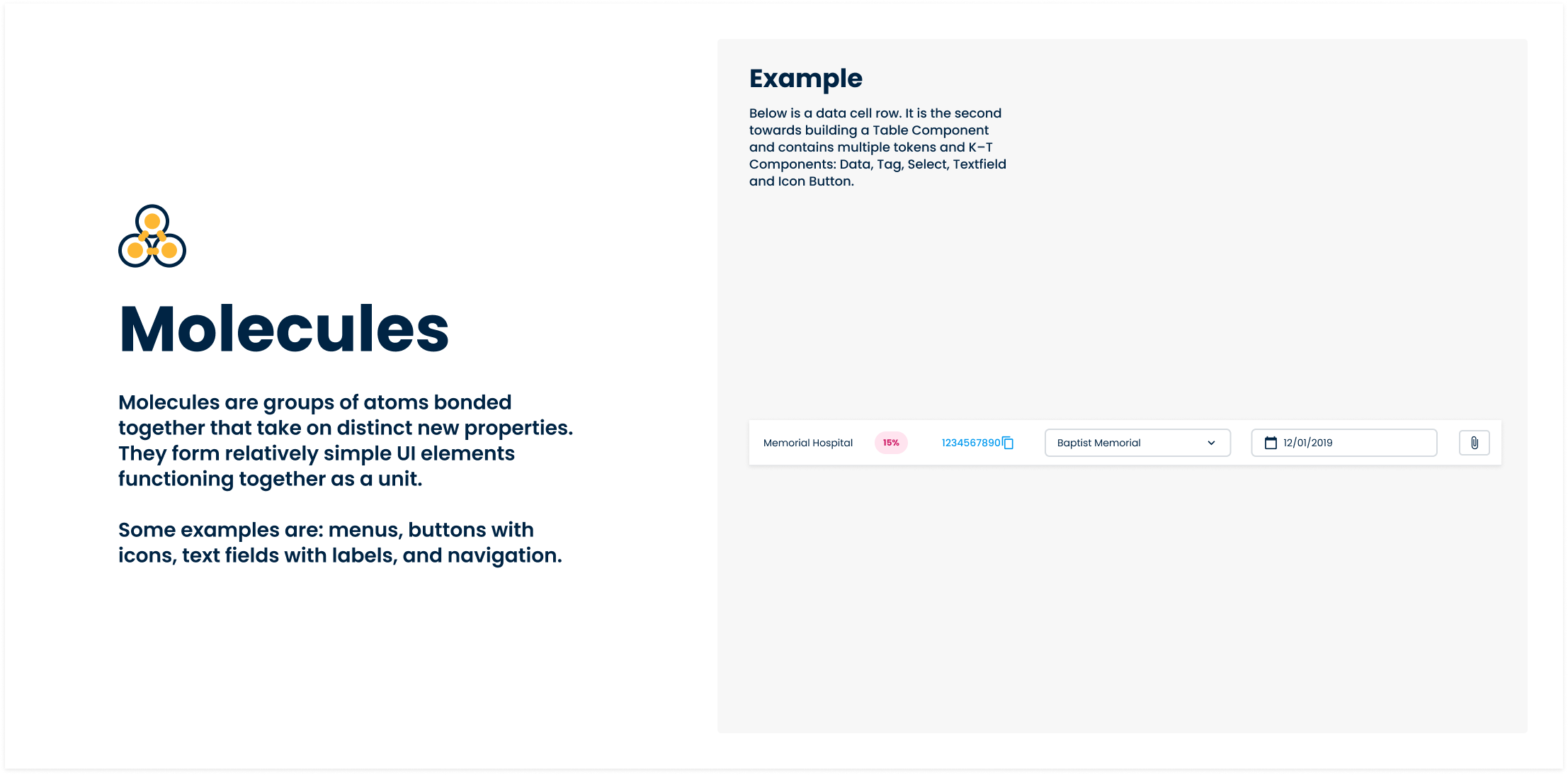
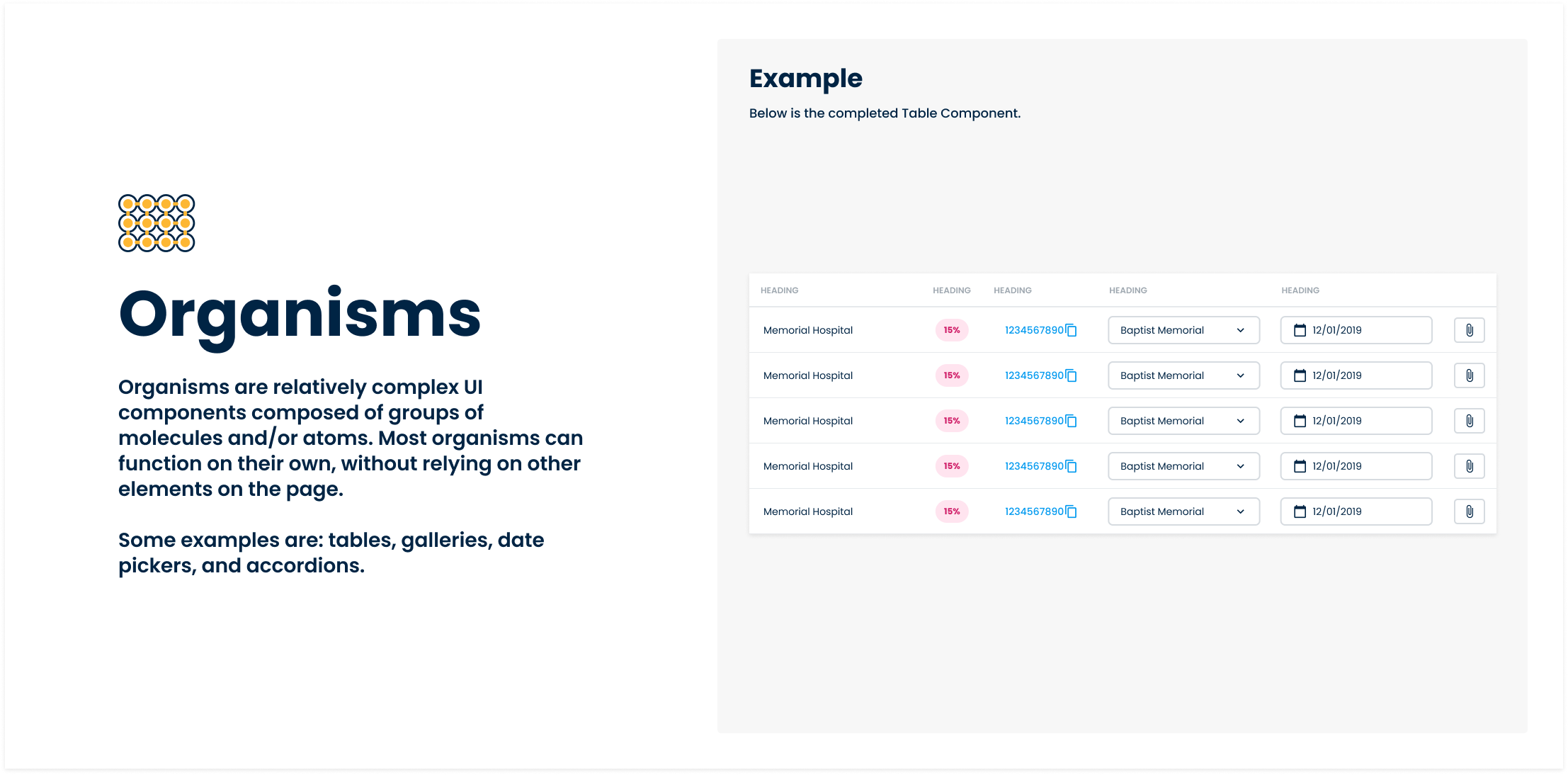
Drawing inspiration from Brad Frost’s Atomic Design methodology, we adapted the model to better suit our needs — organizing the system into tokens, atoms, molecules, and organisms.
While tokens aren’t part of Frost’s original framework, introducing them allowed us to further delineate our smallest elements and establish a scalable foundation that could grow with the system.
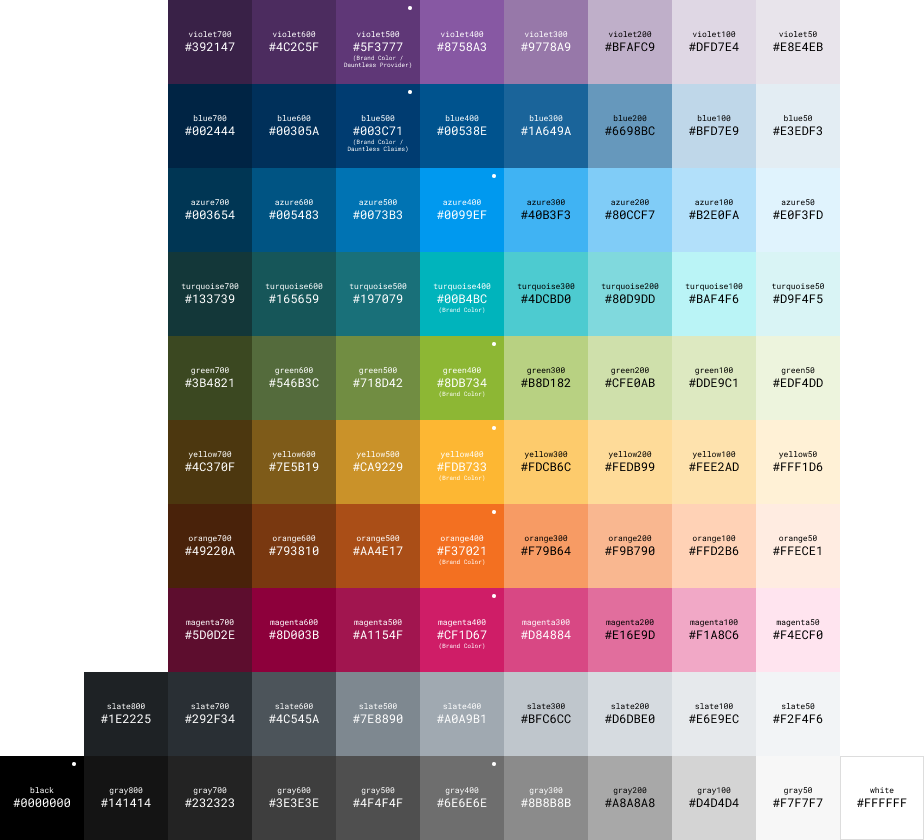
At this point, we defined a set of primitives to align color, typography, and spacing — creating a cohesive aesthetic across all system components.
Making the System easy to use
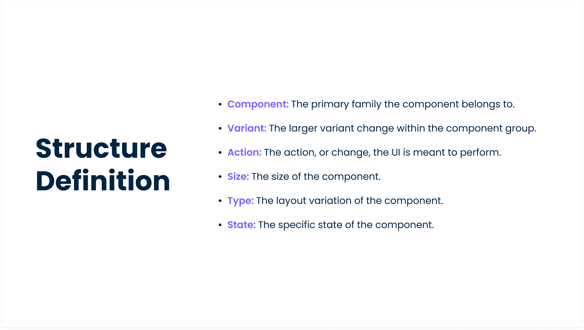
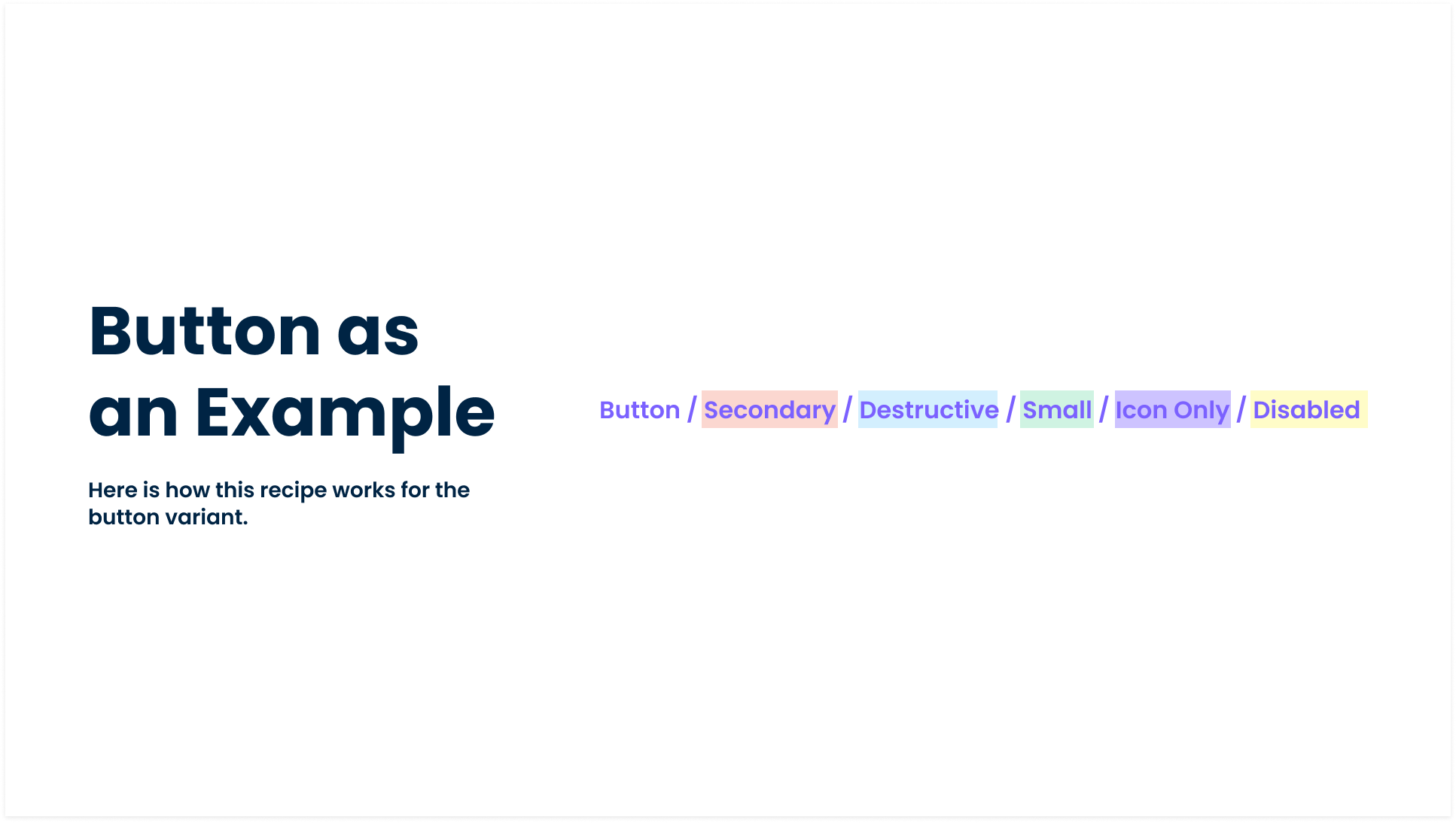
As the project moved into components, we defined a naming convention structure for both design and development.
This structure gave our teams a common language — one source of truth that both designers and developers could rely on. It also laid the groundwork for growth, allowing components to scale seamlessly across products and teams.
An open-sourced icon library was adopted with both filled and outlined versions.
Building Components
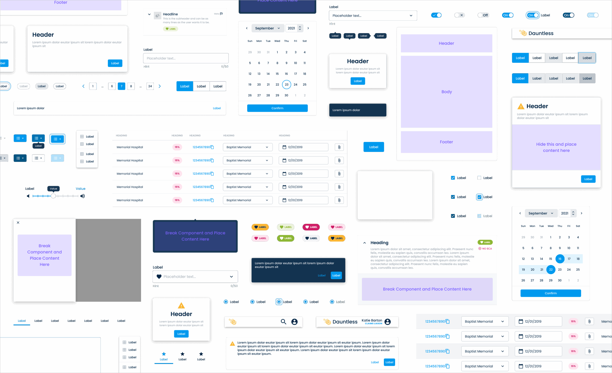
We started with a full audit of our products to understand what we already had — and what we were missing. From that, we identified 31 core components that showed up again and again across our ecosystem. These became the foundation of our design system.
Patterns that existed in only one product were treated differently — stored in the Commons Library as one-off solutions that didn’t require the same level of scalability.
Accordion
Alert
App Bar
Banner
Button
Button Group
Card
Checkbox
Chip
Datepicker
Dialog
Disclosure
Divider
Icon Button
List
Menu
Modal
Navigation Side Drawer
Pagination
Progress Indicator
Radio
Select
Slider
Snackbar
Tab
Table
Tag
Textfield
Toggle
Tooltip
Tree
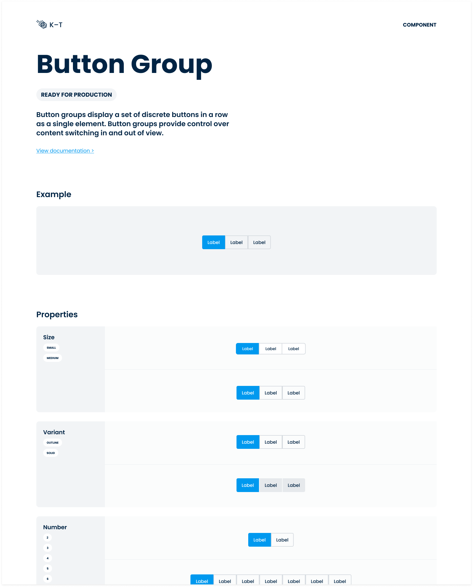
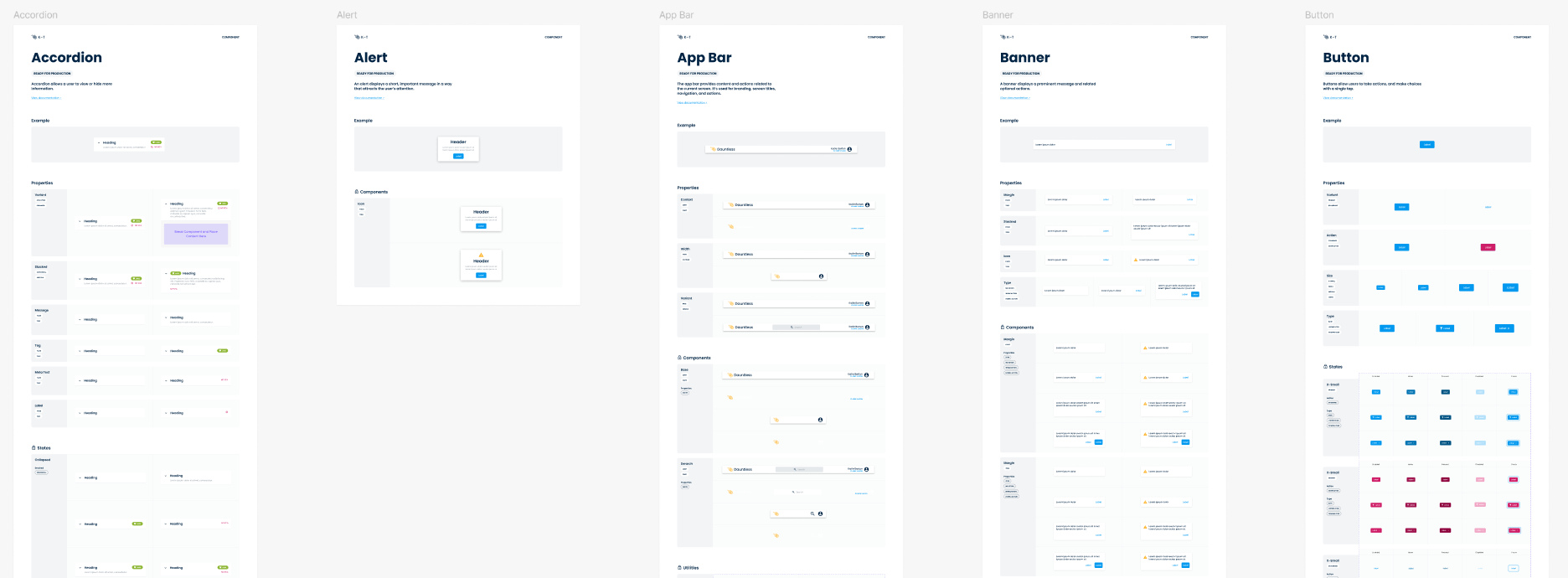
For every component we built, we created documentation that explained not just what it was, but how and when to use it. Each page included a description, visual examples, and a breakdown of its states, properties, and variants — giving designers and developers a clear, shared understanding of how to apply it consistently.
Helping the system self-scale
As K-T began to take shape, we needed a way to keep it healthy as it grew. We created a
Solving templates, layouts, and patterns
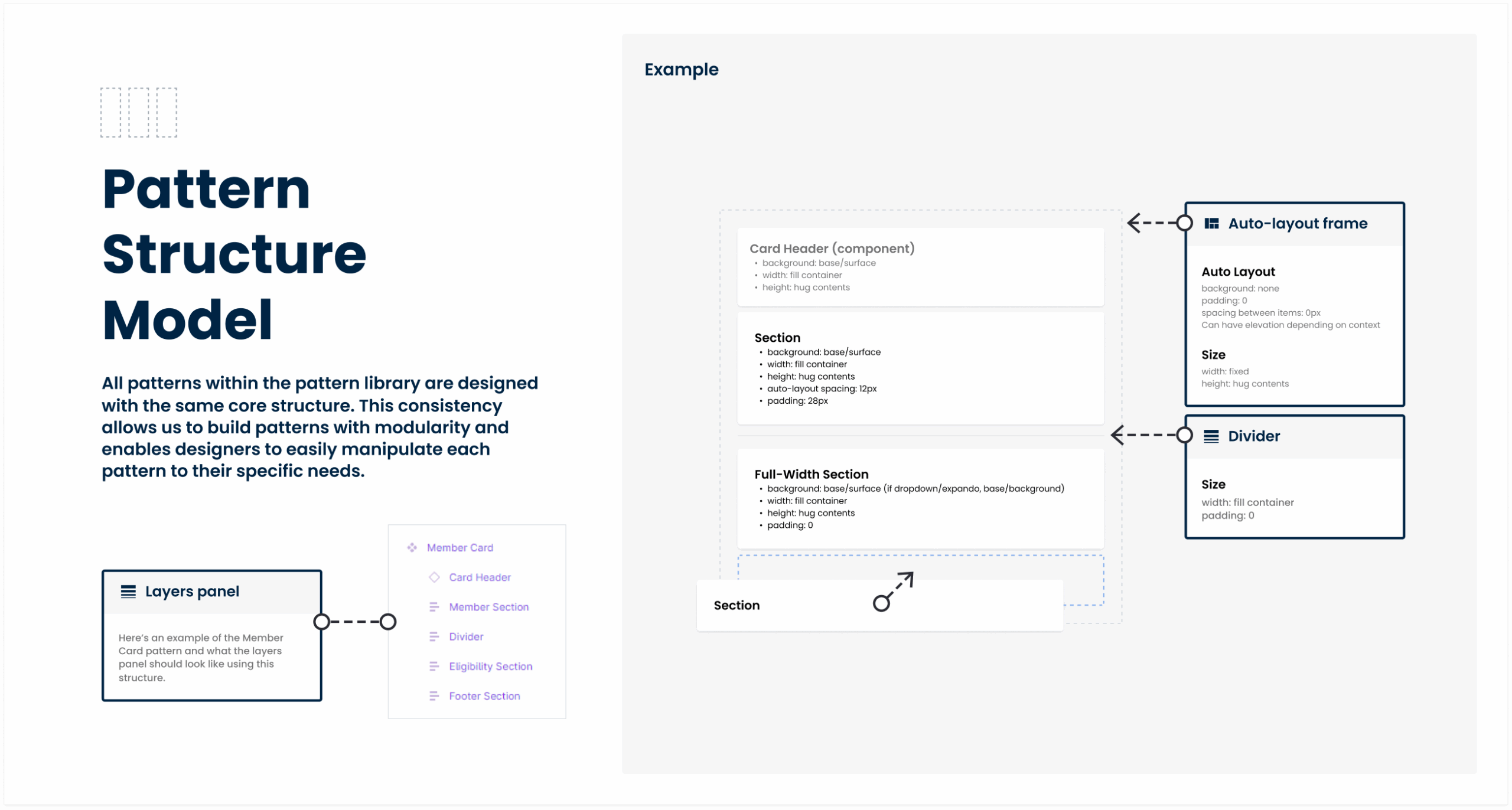
As our product ecosystem expanded, we started to see the same design patterns appearing in different places — built separately, but serving similar purposes. Atomic Design’s Template stage covers structure, but what teams really cared about was the data each pattern represented.
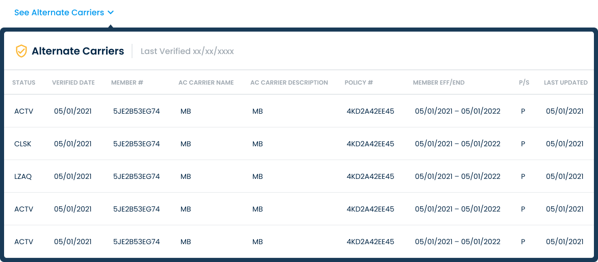
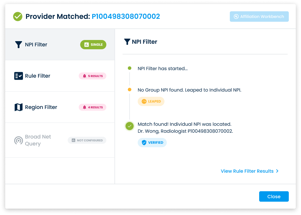
So we created a Pattern Library — a layer above the Design System — where these shared, data-informed patterns could live and evolve together.
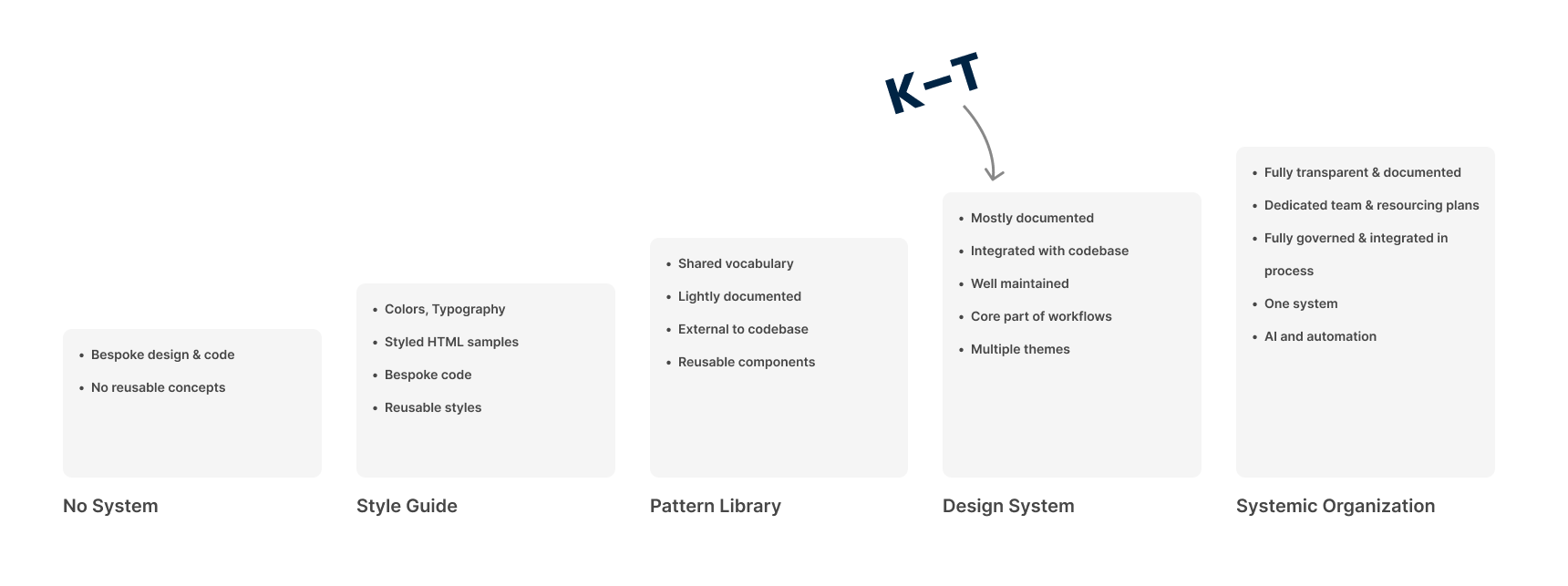
Measuring Design System Maturity
It’s important to acknowledge that design systems carry ongoing costs — primarily in maintenance, governance, and continued investment. As a system matures, these costs naturally increase.
Each level of maturity offers its own advantages and trade-offs. In most cases, teams should remain at a lower level of maturity until the lack of advancement begins to inhibit progress or scalability.

