Lantern Case Study
What is Lantern
Lantern is a application that provides analysis, insight, and recommendations in trading stock by using artificial intelligence.
The Problem
- Inability for a user to buy, sell, or trade stock.
- Inability for a user to integrate with other trading platforms.
While Lantern is designed to provide analysis on stocks and options trading, an important distinction is Lantern in itself is not a trading entity. This means that when a user of Lantern received insight and recommendations on how to proceed with a stock or option, the user would still need to pivot to another trading application in order to complete the transaction.
The Solution
By integrating with other already-built solutions, we will enable a user to receive Lantern insights and analytics without needing to increase the company’s risk and legal liability by becoming a trader. Instead, we can allow users to buy, sell, and trade options by integrating seamlessly with other applications while maintaining control of the user’s experience.
Competitive Analysis
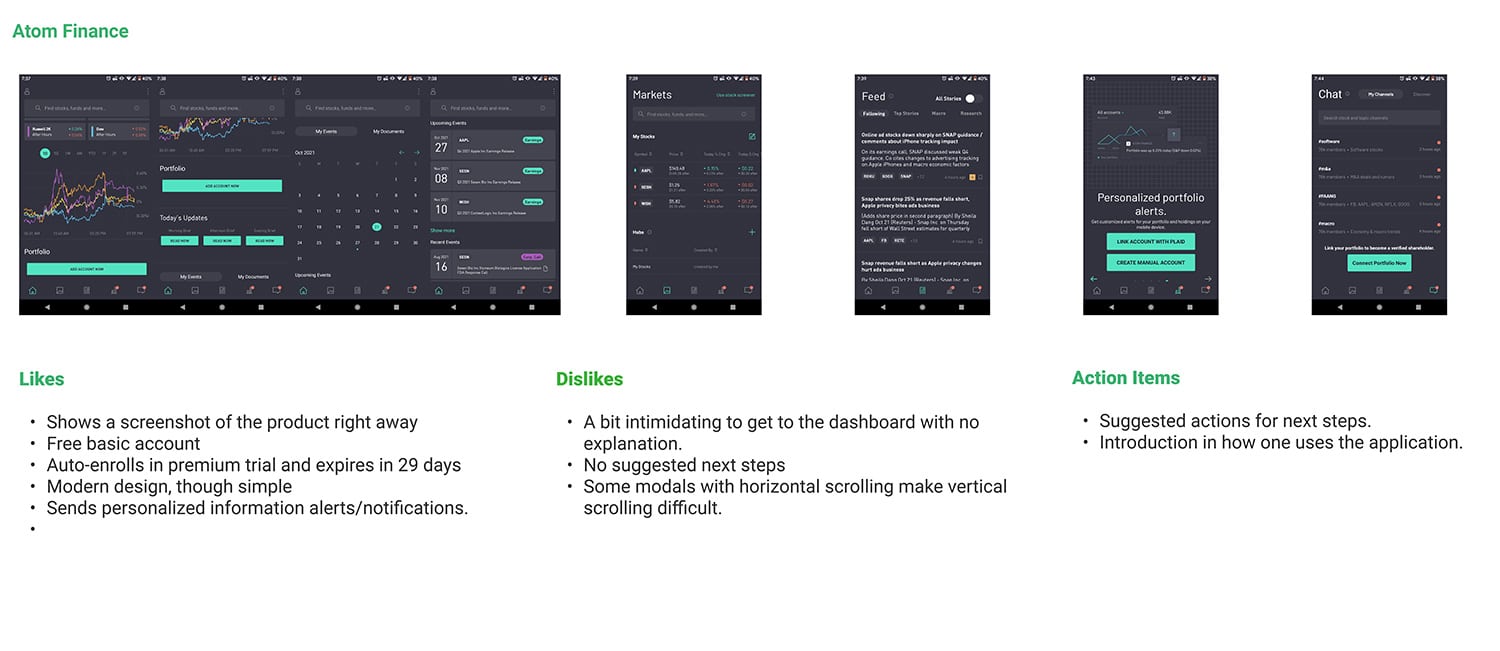
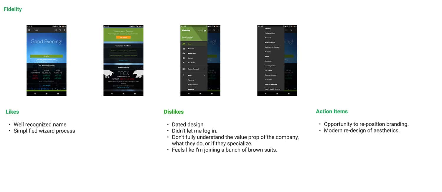
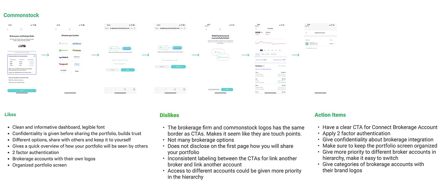
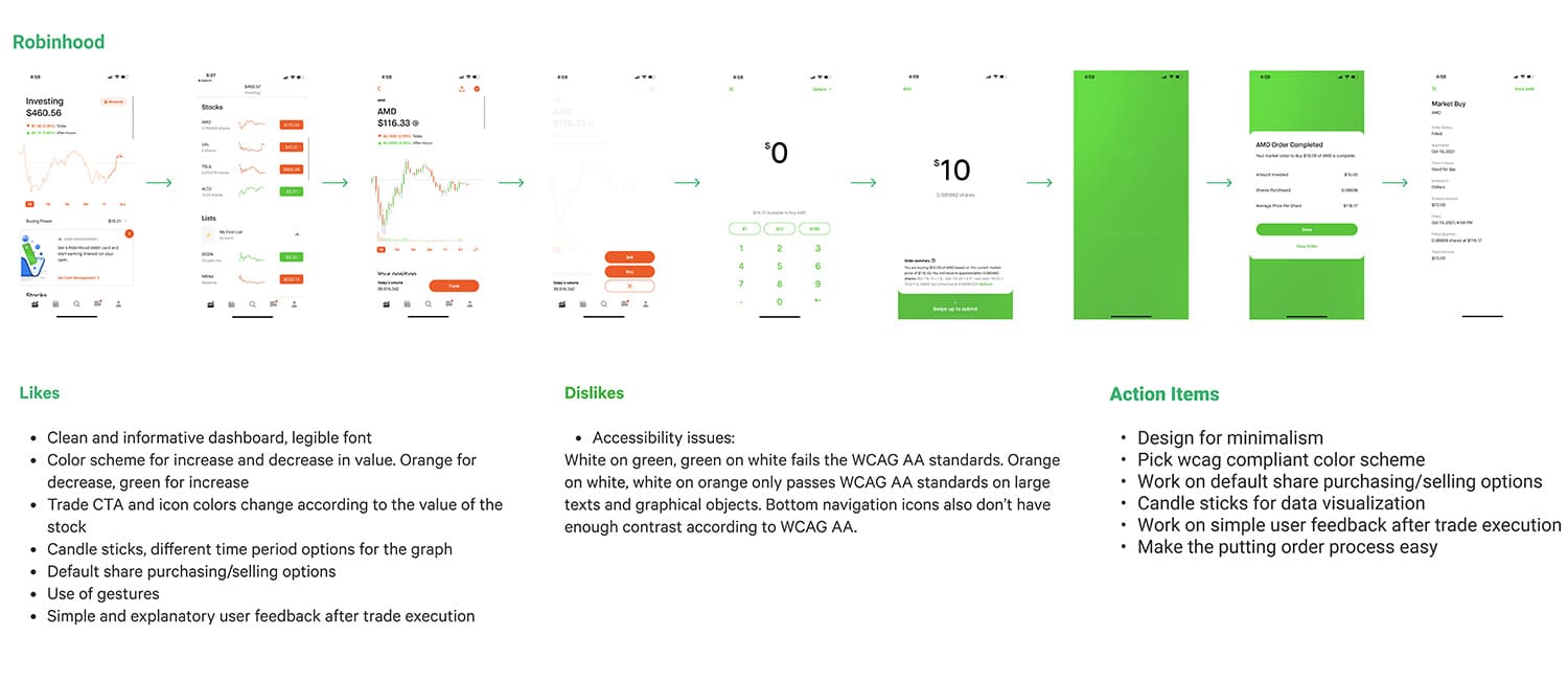
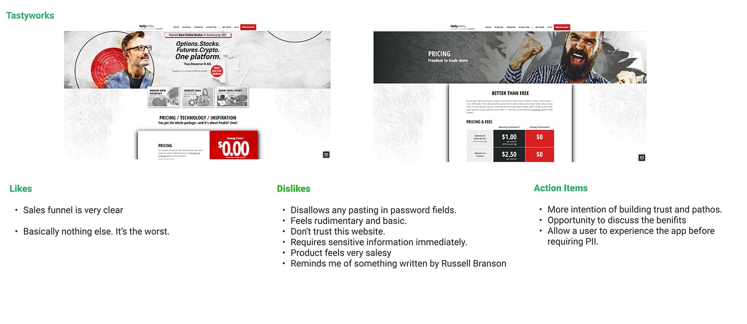
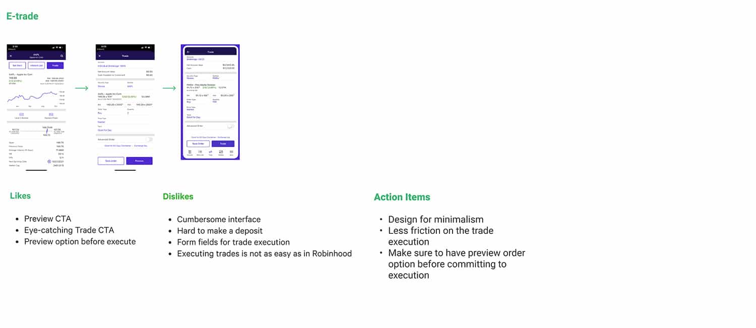
In terms of stock analysis, Lantern had many soft competitors providing data and graphs but only a few hard competitors that attempted to solve insight and recommendation. Of these competitors, we chose the six that were most relevant: Robinhood, E*Trade, Commonstock, Atom Finance, Fidelity, and Tastyworks.
Sign-Up Flow
While the competitive research stayed fairly high level, one section I decided to research deeper was the onboarding process for each application. This process allowed me to better determine what audience each application was targeting as well as expose what integrations, if any, the application attempted to build along the way.
Tastyworks provided the most lengthy onboarding experience and attempted to receive all potential information from the user before the application was able to be observed.
Atom Finance provided the shortest onboarding experience and prioritized getting users into the application before attempting to finalize conversion.
Comparing these two applications isn’t perfectly apples to apples, however, we knew the Lantern onboarding experience should more closely follow Atom Finance and increase observability of the app before attempting to complete the conversion.


Key Takeaways
Simplicity is king
Actionable CTAs / Next Steps
Build trust
In reviewing competing apps and their onboarding experiences, I had three main takeaways in how I wanted to move forward with Lantern.
Simplicity is king. Trading stocks is already massively complicated environment and can easily be made more complicated by providing too many options at one time. Knowing Lantern is providing analysis and insight for the user, it makes more sense to target less knowledgeable users who may not have the most experience within the realm of trading. With this in mind, Lantern should strive to provide the simplest experience possible even if that experience could slow down a power-user.
Clear and actionable next steps. While typically good UX advice in general, it was discovered that few of the competing apps provided an experience that walked a user through the environment or how the industry works. It was expected that any user within the application already knew the ins-and-outs of trading. With Lantern, it become clear that proving a more hands-on experience could not only encourage more use and better target our demographics, we could also create differentiation from other applications along the way.
Build trust. As exemplified by Tastyworks, the industry of trading has either little brand direction or a direction that is more in tune with car sales than finances. These companies require more personally identifying information than a bad actor would need to steal your identity. It is absolutely imperative that users feel trust in the company to which they’re providing their information.
Mapping The Process
In reviewing how competition enabled their users to sell stock, it became apparent there was a familiar and standard route. Not only was there no need to re-invent the wheel, doing so would provide an experience users were familiar with and potentially increase friction to any stock trading—particularly with inexperienced traders.
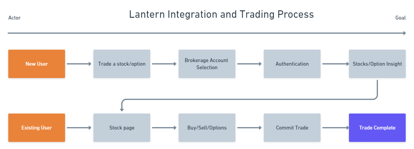
Below is the ideal process of how a new user would integrate with another service as well as complete a transaction. By placing the integration process in the middle of the flow, we enable users to observe using the app and build trust with the company before any personal information is needed.
Wireframes
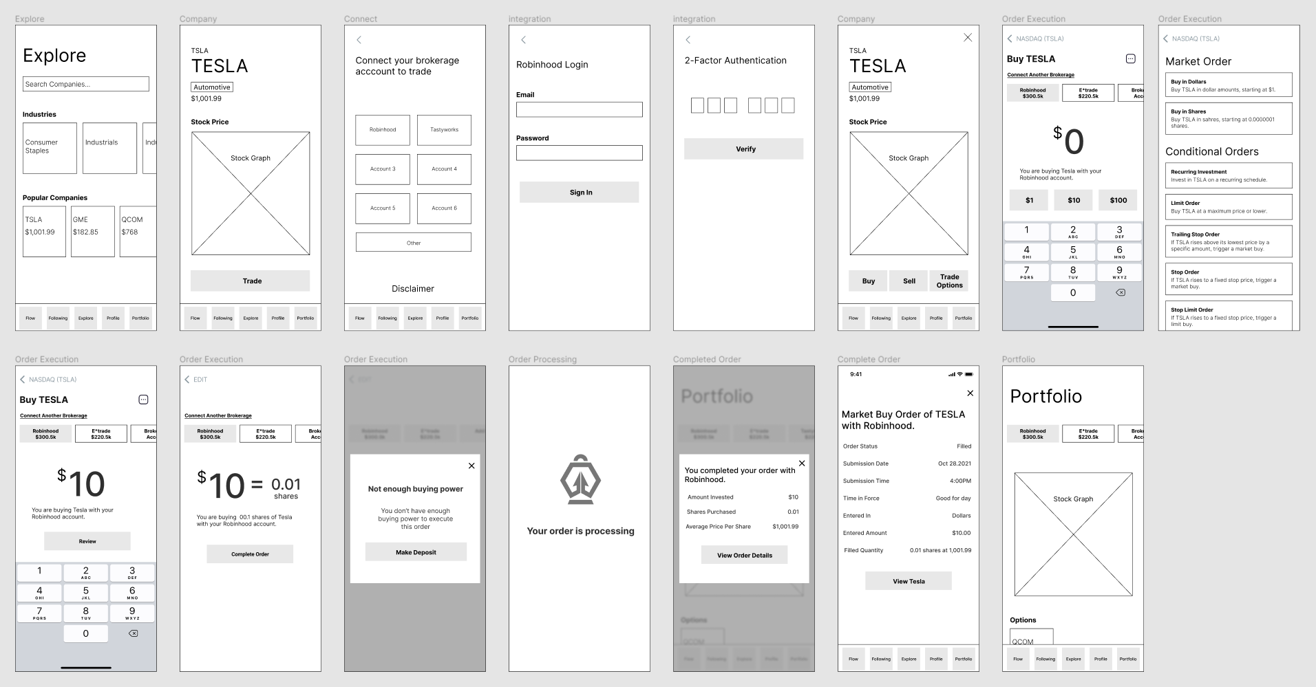
Based on the ideal flow above, wireframes were created as a rough draft allowing a visual representation of the application start to take shape.
Testing & Validation
Wireframes were then prototyped and tested with users. Because most of the workflow was already determined by the industry, there were only a few unexpected results that needed modification before being able to confidently move into high-fidelity mockups.
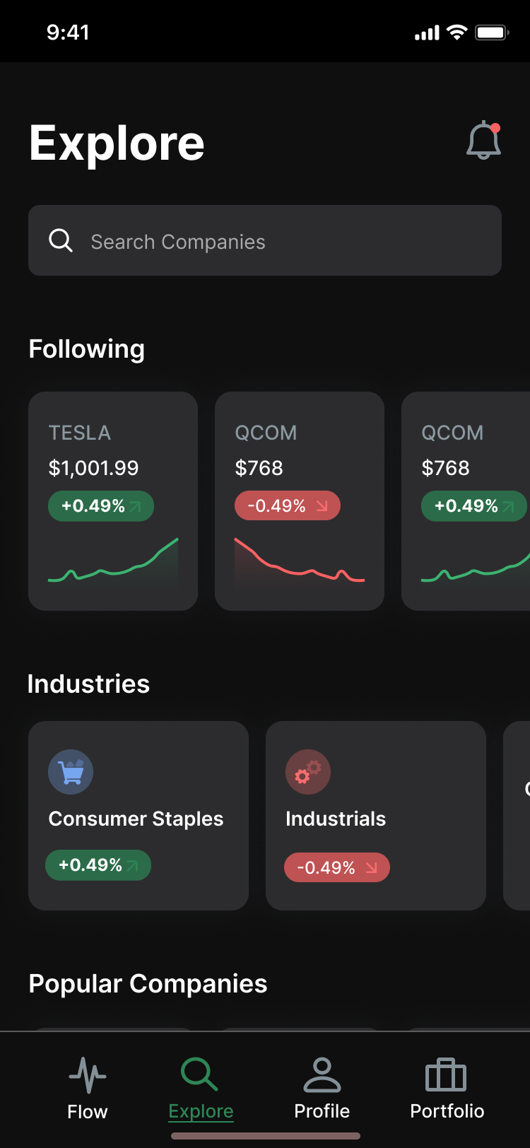
Merge Following with Explore. The Following screen and the Explore screen, while solving two separate problems, were consistently confused between one another and intentions behind each screen. Rather than attempting to further differentiate the two, it was decided the screens were related enough that combining them made more sense.
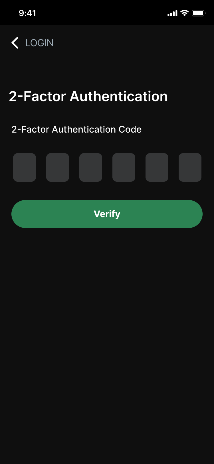
Two-Factor authentication. Now that we had a plan of action for integrating with other applications like Robinhood and E*Trade, something we hadn’t accounted for was the need to multi-factor authentication.
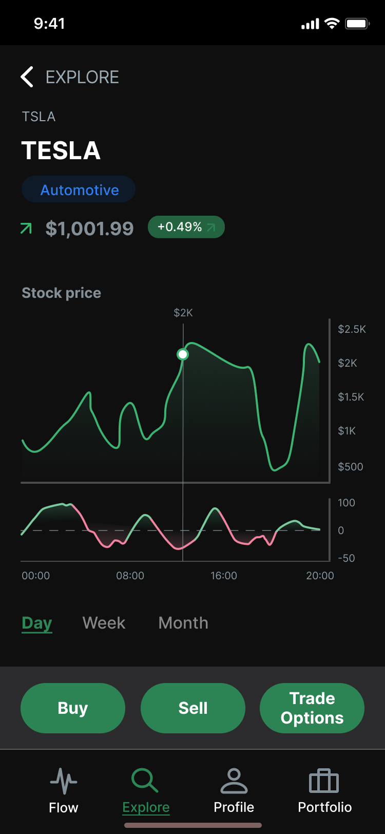
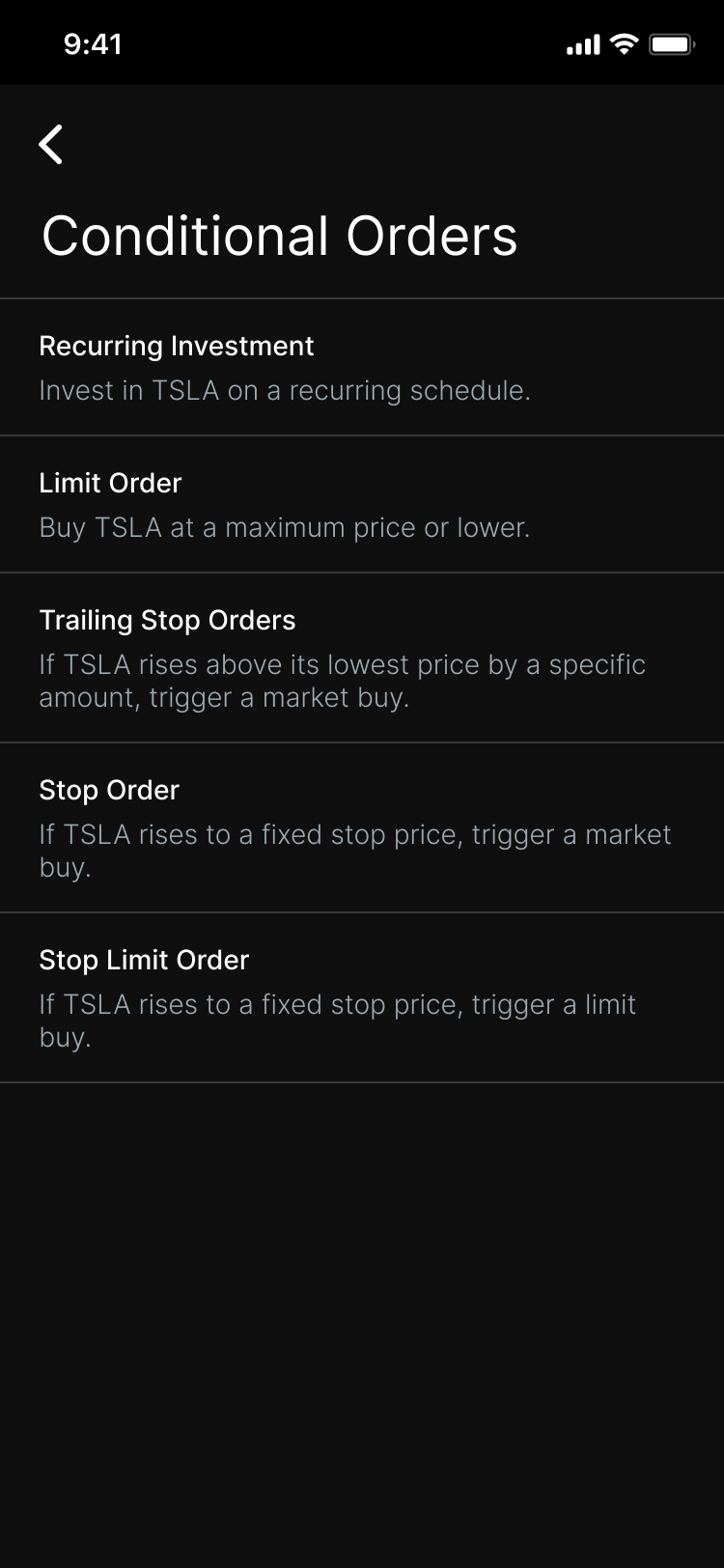
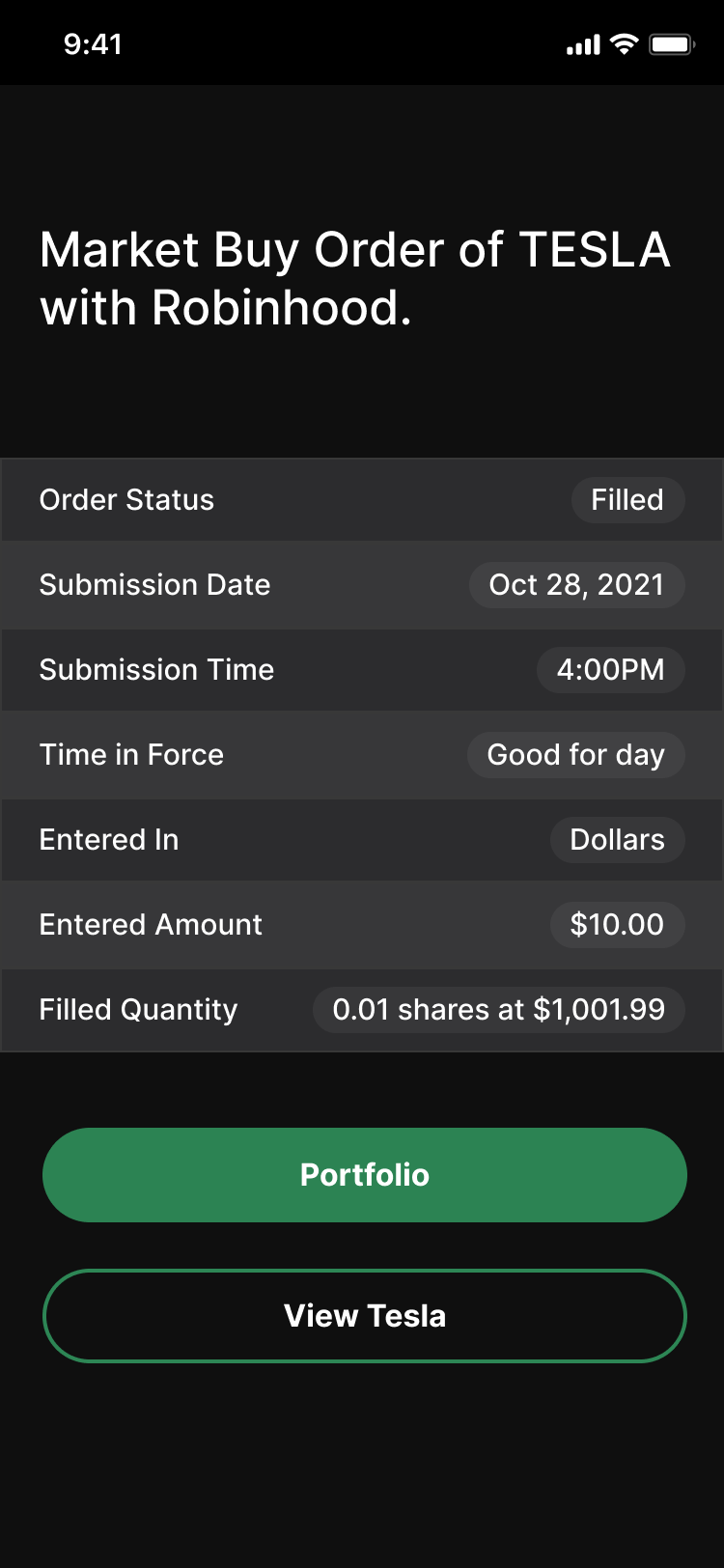
Conditional orders. For those unfamiliar with stock options and trading, conditional orders are a section of the industry that becomes complex and deep quickly. Robinhood even requires the user sign a waiver before allowing a user to open this section of the application. Lantern didn’t originally provide this section of the application but discovered in testing that not providing it was a barrier of entry for users and their desire to adopt the application. Conditional orders had to be included.
High Fidelity Mockups
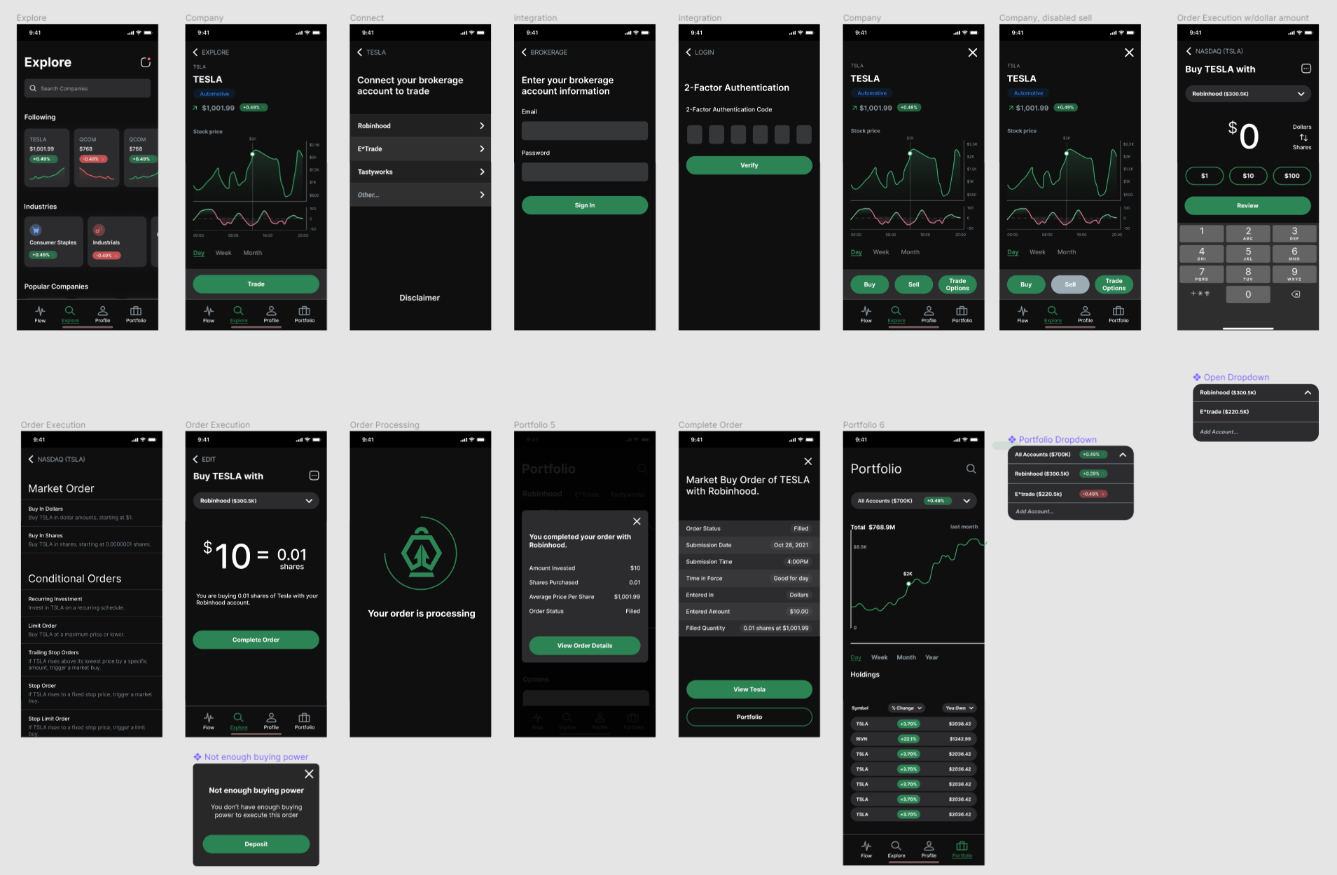
High-fidelity mockups were created based on the wireframes including any modifications discovered in testing. Mockups and prototype were built in Figma.
Testing
With a high-fidelity prototype built, Lantern went through another round of testing to validate some of the previous hypothesis and iterations. While our previous alterations went smoothly, new discoveries were made with the introduction of the more detailed design.
- Users struggled to understand the meaning of the notification icon. This prompted us to alter the icon to another that emphasized a less styled and more traditional approach.
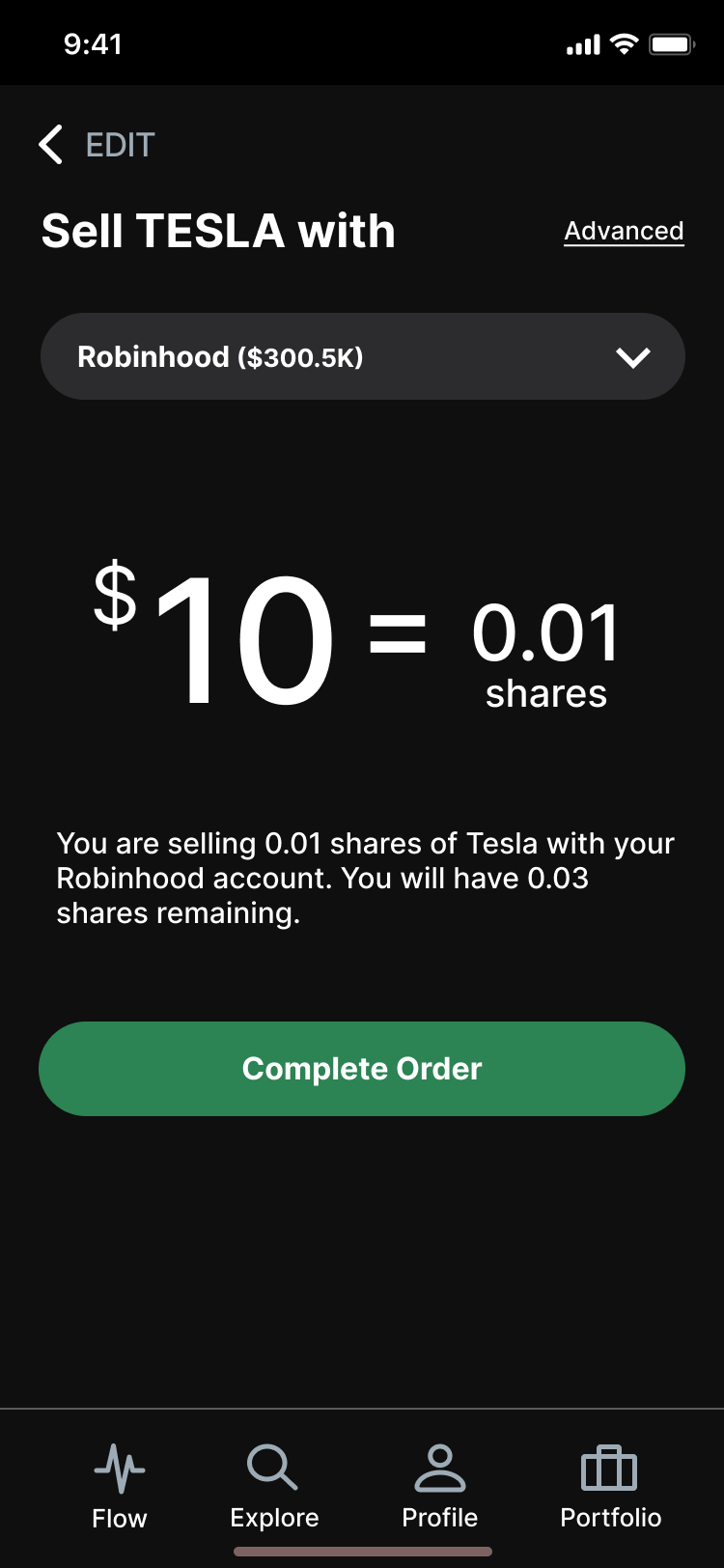
- Users were unanimous in preferring to purchase stock with the unit of dollars rather than in shares. Lantern provides a toggle enabling a user to switch between the two but users were having difficulty finding it. The toggle needed to be made more presentable.
- The conditional order icon wasn’t understood. Truth be told, who knows what a good icon for “conditional orders” is. Instead, the icon was switched to using the word “Advanced” as a textual link.
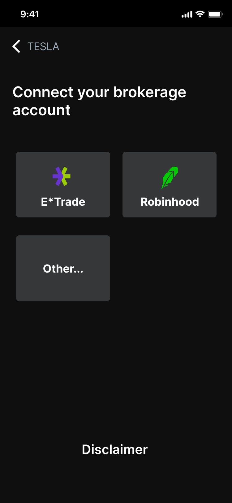
- The phrase “Add Account” was changed to “Connect Another Brokerage” after learning users had the perception that they were able to connect a bank account rather than a trading account.
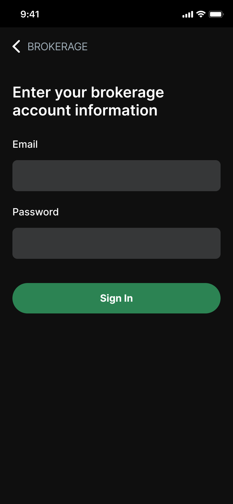
- The initial page of the brokerage integration was somewhat confusing to users. By changing the layout from a list view to tile view, users were able to correctly perceive that the screen was designed to begin integrating third party apps rather than the integration having already been made and the third parties just being listed.
Final Design
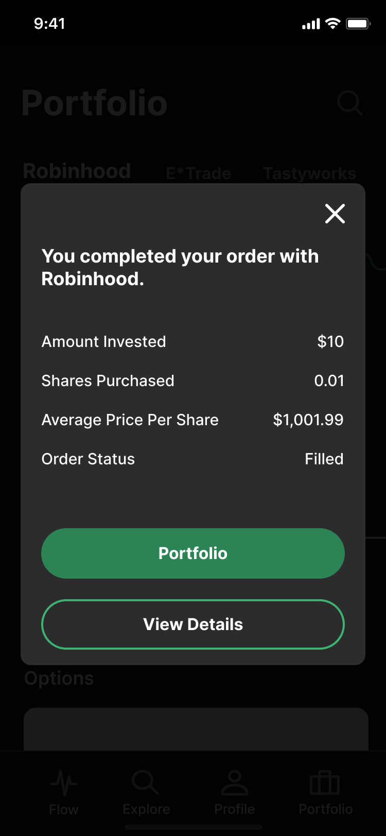
Below are some screenshots of the final design.
