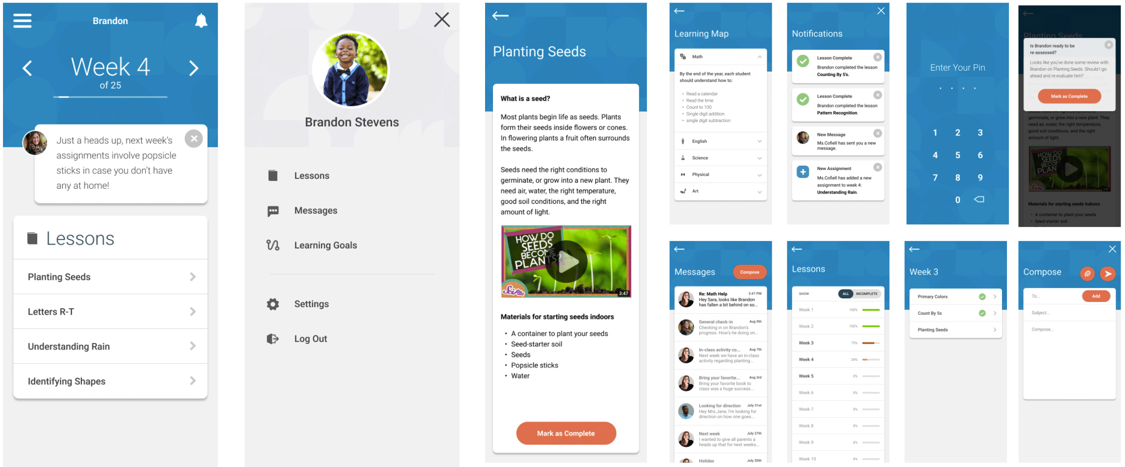
UX Process — Learning From Home Case Study
The Problem
During COVID-19, school districts have witnessed a decline in education among their students attending school from home, particularly within the lowest grades. Learning From Home is an app that partners parents with teachers so parents can assist in teaching from home while mimicking the same topics taught in the classroom.
The Solution
The Learning From Home app looks to solve two significant hurdles parents and teachers face during at-home, asynchronous learning:
- Teaching parents how to teach their children.
- Enabling parents to mimic and extend the day-to-day curriculum taught by the teacher.
Solving these two hurdles will enable children to keep up with standard curriculum despite the disadvantages of at-home learning as well as enable parents to be more involved in their child’s education without much alteration to routine.
My Role
My role in this project includes user research, defining and scoping an MVP, low and high-fidelity prototypes, and user testing. Everything shown below is strictly my portion of the Learning At Home project.
The Product
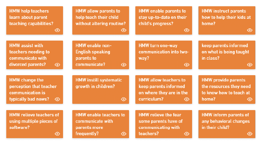
How Might We Statements
Based on HWM’s, a card sorting exercise was done to focus the scope of the project and begin defining the MVP.
Personas
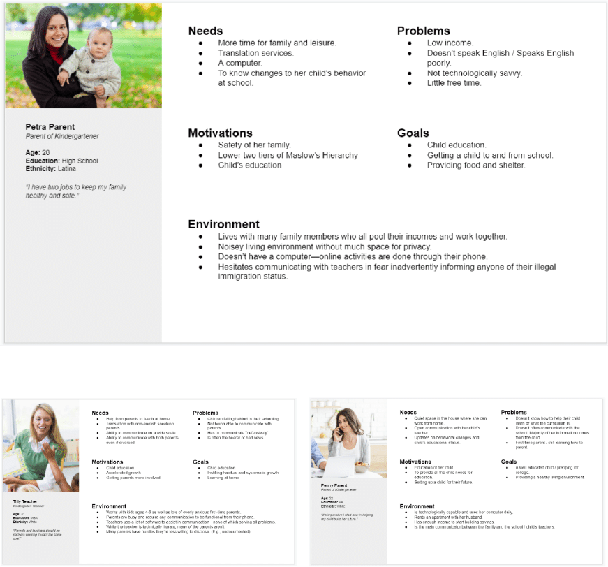
Proto Personas were created to start developing a target audience and narrowing focus.
Defining the MVP
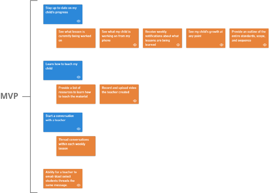
For the MVP, the focus was maintained on solving two hurdles of the target audience: the need to know what their child is currently working on in school and the ability to learn how to help teach those same topics at home.
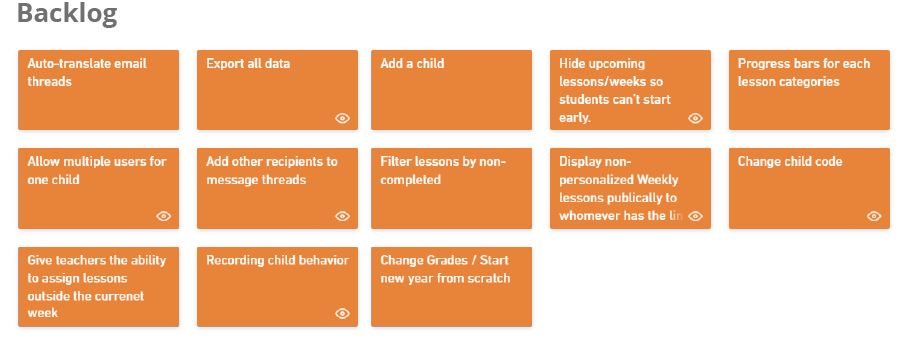
Card Sorting
Based on HWM’s, a card sorting exercise was done to focus the scope of the project and begin defining the MVP.
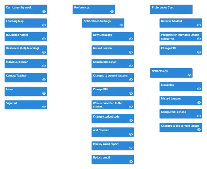
Results Matrix
Based on user feedback, categories were defined, refined, and the beginnings of a site infrastructure began to take shape.
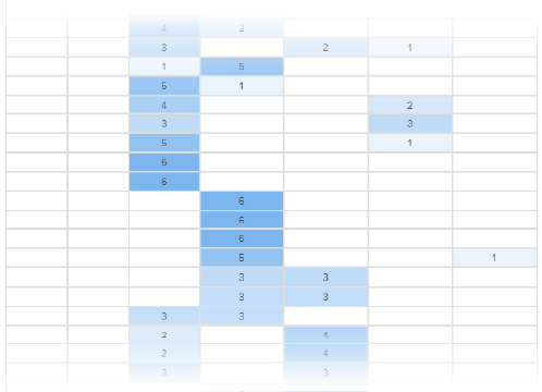
MVP Site Map
Based on the restrictions of the MVP, an estimated site map was created. While the names of pages might change, the overall structure of the project will remain.
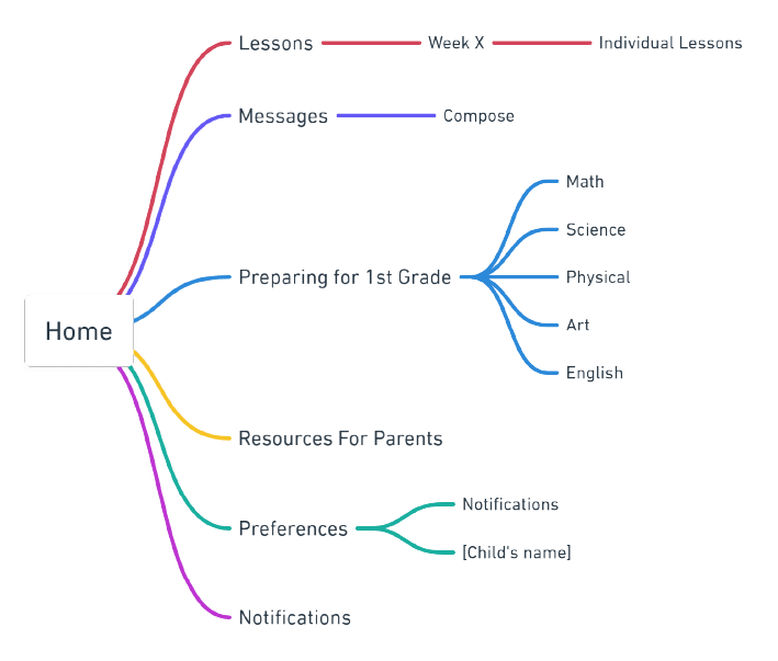
User flows
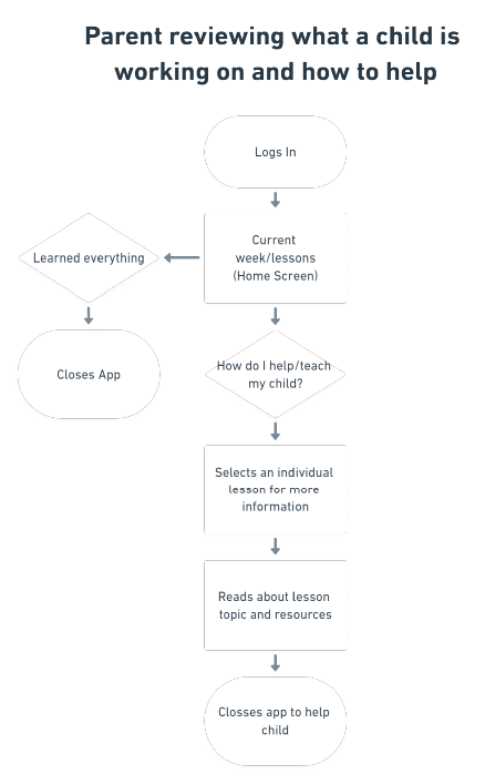
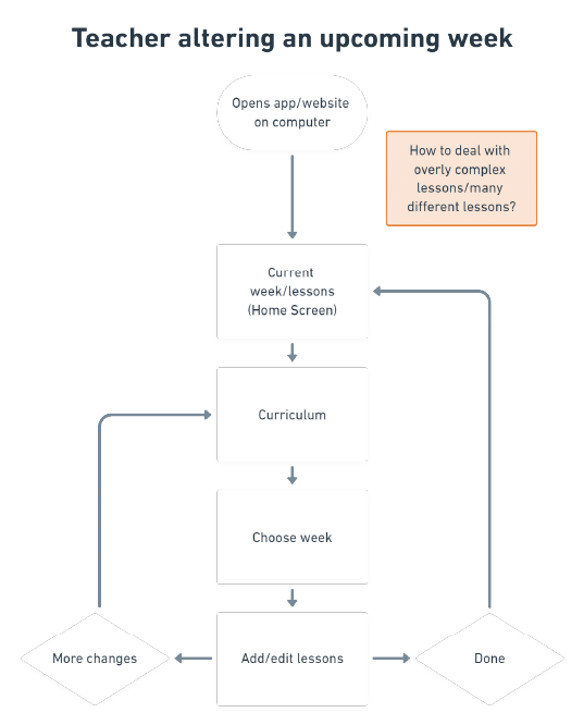
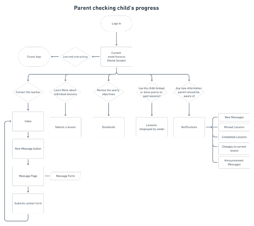
User flows were created to visualize red routes and gather team consensus.
Sketching and Prototyping
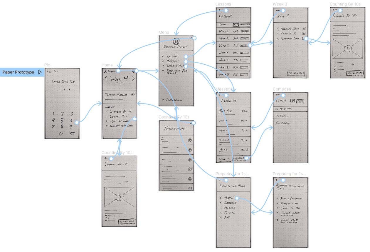
Rough wireframes were created as a method of detailing the form the content would displayed. A functionable prototype was built in Figma and tested with live users.
Testing and Analysis
The prototype was tested with five users in a live setting. Users were asked to complete the following six tasks:
- How might you discover what your child is currently working on at school?
- Where would you find the goals and objectives your child needs to complete to be prepared for 1st grade?
- How would you go about discovering if your child had missed any previous lessons throughout the school year?
- How might you inform the teacher you plan on working with your child at home to get caught up on previously missed assignments?
- How would you inform your child’s teacher that you and your child have worked on a previous lesson at home and are now caught up?
- Where would you look to better prepare for upcoming lessons?
Below are the results from those tasks with 5 being the most functional and 1 being the least functional.

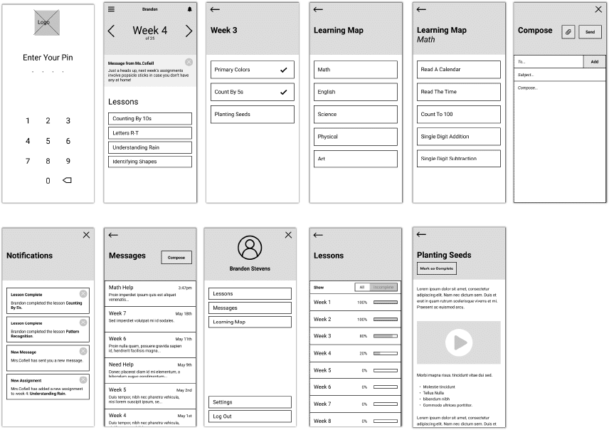
Wireframes
Wireframes were created in reference to the sketches. Some alterations were made based on the ease of use from the user feedback.
Wireflows
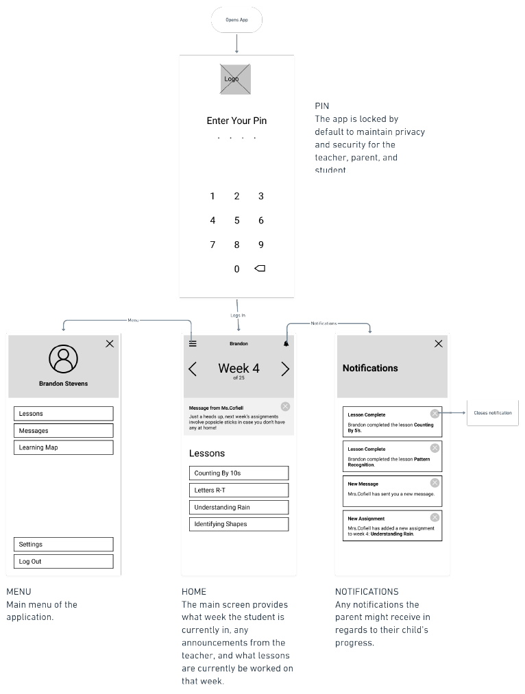
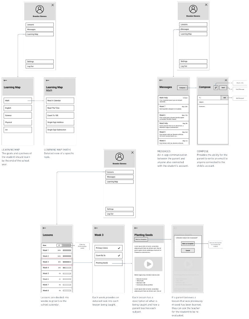
Wireflows were then created to better communicate with any stakeholders, designers, and the development team.
Styleguide
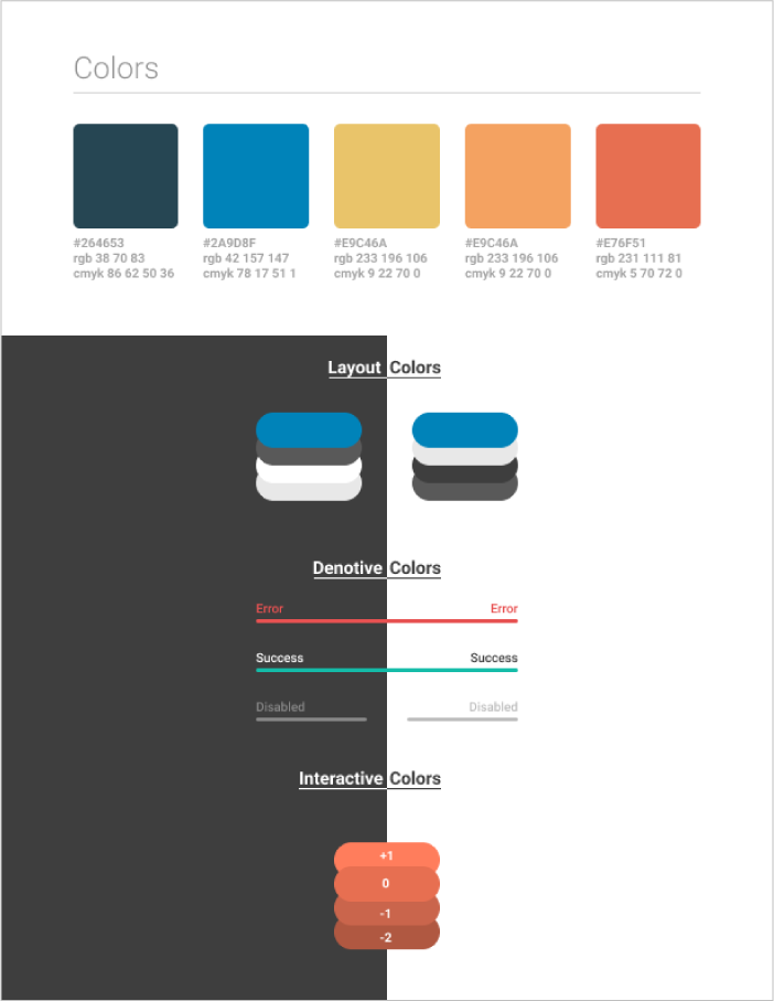
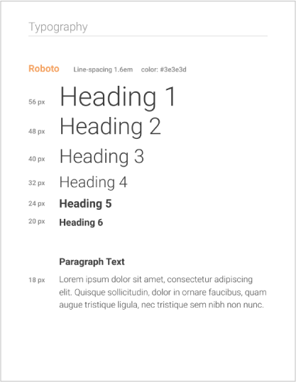
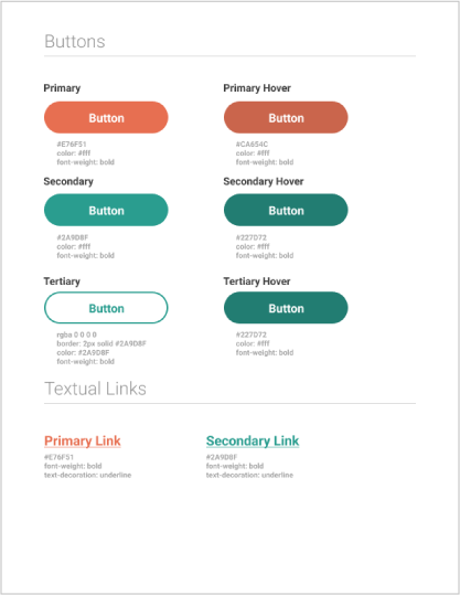
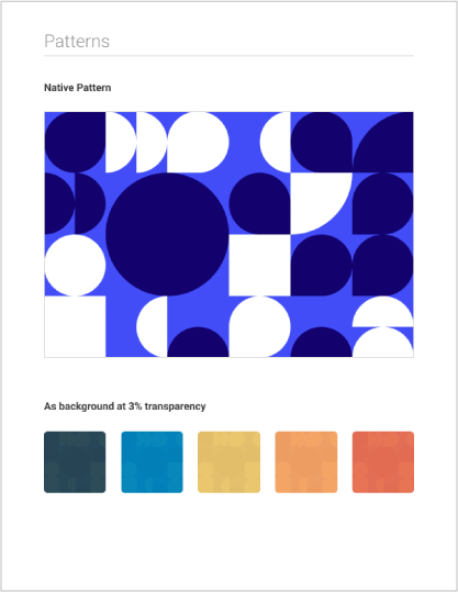
With the functionality designed, the workflow can transition into aesthetics. Because this product is within the education space, students are well accustomed to Google’s ecosystem in both hardware and software. By following Material Design specifications, the aesthetics of the application will be more comfortable and familiar to all students.
High-Fidelity Mockups
High-fidelity mockups were created based on the specifications within the style guide. Note that while the process of creating a style guide began before high-fidelity mockups, these two phases inspired one another and grew together—both changing as the design matured.
