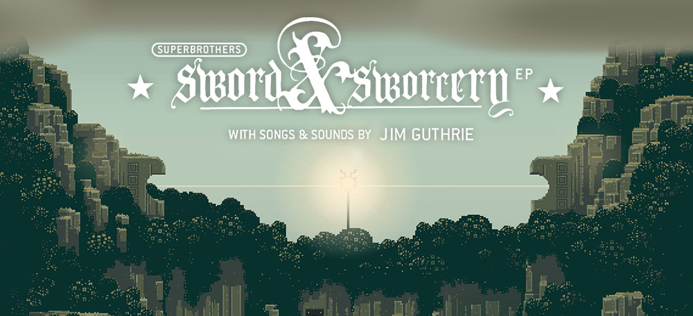
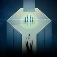
Superbrothers: Sword & Sworcery is an adventure side scrolling puzzle solver and feels quite unlike any other game I’ve played. While some puzzles remind me of something you may find in one of the original Zelda’s I’m reluctant to make the connection because the gameplay is so different. It’s beautiful, unique in story telling and humor, but most of all it’s actually quite relaxing.
 This game was released for iPad in 2011 initially and for computer later the next year. Because I’ve played through this game twice starting with the computer I experienced the gameplay twice in different settings. There’s definitely no doubt about it, this feels like a game best suited for a touch device. Designating where you’d like your character to move by tapping on the screen felt very fluid and seamless. One could also pan around the environment by simply swiping in the desired direction. With that in mind, nothing was poorly crossed over to computer and felt almost as natural there. The only hint you might see on the PC are the subtle mentions of actions that might imply a touch screen.
The other main difference between the mobile version and the pc version was the ability to rotate the screen. When entering a battle or opening up the Megatome (a large book you carry on your back) one would rotate the device to portrait mode. On the computer they simply allotted the use of the right mouse click rather than having to turn your entire desk sideways (which is kind of them).
 Another item I might mention is the wonderful soundtrack. I’ll mention it more in depth below but I fear those that play this game on a mobile device miss out by listening to the games composition through their terrible device speakers. Trust me, if you’re on a mobile device, this is a game you’ll want to put your headphones on for. Jim Guthries pieces really add a considerable amount of feeling to the game and highly recommend checking out his other work.
With all of that in mind I don’t suggest one platform over the other. Both have their difference but had an equally good time in both settings.
Pixel Art
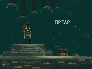
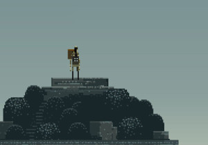
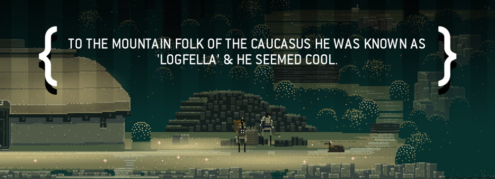
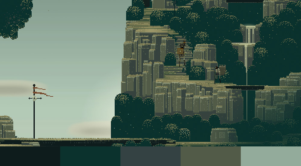
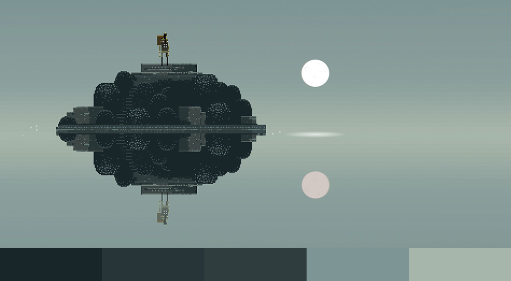
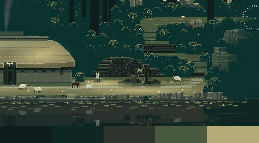
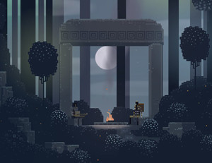
 The artwork of Superbrothers: Sword & Sworcery is probably the most unique and noticeable style this game offers over other games. Despite looking like the game only supports a few colors, the images and screenshots you see simply don’t do the game justice. Bushes move to the feel of the breeze and give you the feeling of motion throughout the game. Other pixels glow giving off brilliant shades of the surrounding colors and even slowly pulsate like a candle. You can even see fireflies and birds living in their pixel world completely unaware of the 8-bit texture they’ve been given. The style is truly remarkable and will definitely be in later games Capy develops.
 The pixel style was manufactured in a program called Pro Motion, a piece of software developed for animation and drawing by a company named Cosmigo. The text and other vector elements (like the spirits themselves) were created in Adobe Illustrator. We also know they used Photoshop but all that’s been stated is it was used to add in some “special sauce.” I don’t have a good answer for you on what they used Photoshop for but I suspect it was mainly used to add gradients to backgrounds and glowing effects on certain elements. Both these things can be done with Adobe Illustrator but Photoshop makes the process much easier.
As for who developed the style for the game, I honestly can’t tell you. I ended up emailing Capy asking them directly but they never ended up getting back to me. There’s a gentleman named Sylvain Coutouly who states he’s a 2D artist at Capy but I can’t be sure it’s the same guy. The styles he posts on his Tumbler page seem to be quite different from that of Superbrothers. If anybody has some information I’d love for you to send me an email so I can put more research into the guy. Whoever it is, their work is truly amazing!
Typography
ITC Conduit
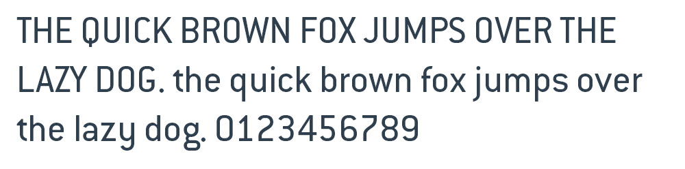
With the exception of the logo font, the only font used in the entire game is ITC Conduit. Designed Mark Van Bronkhorst, Conduit has a whopping 63 different typefaces in the family and, at the time of this publication, is 45th best seller on myfonts.com. The only other thing I can mention is the game tightly kerns the lettering much past what the font’s default suggests.
While I’m sure there are other fonts out there I’m unfamiliar with the closest I was able to find in both aesthetics and quality was DIN Next Pro. I don’t normally like to have similar fonts be more expensive than the original but I don’t have much of a choice in this case. If you know of a better related font feel free to suggest it in the comments below or email me directly.
The logo font I wasn’t able to find, unfortunately. It’s possible it’s custom or simply has embellishments on top of another blackletter typeface but I don’t get the feeling either of these were the case in this instance. I suspect the font is out there somewhere.
With that in mind, I was able to find two fonts that were quite similar in style: Amador and Goudy Text Mt. Hopefully either of these are good solutions for your requirements.
Interface
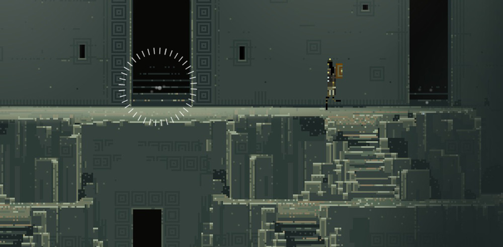
 Because this game was originally designed with a tablet in mind the controls are extremely simple and minimalistic. When the character is moving there’s nothing impeding your view at all. No life or stamina bar, nothing that says you have anything equipped, not even a map to let you know where you are. In fact, the only button that ever appears is the menu button and only when your character stops moving does it even let you know it’s there. Because of this, the gameplay is absolutely clean and gorgeous. No distractions… just the environment.
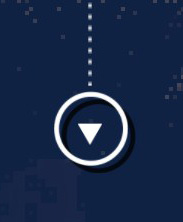
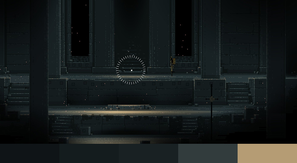
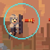
When traveling the destination is indicated by a spinning reticule not terrible unlike the crosshairs from a first-person shooter. This may seem like a subtle thing to mention but this is the only object in the entire game that controls your entire character (with the exception of battles with give you two more buttons) so it’s important to get it right.
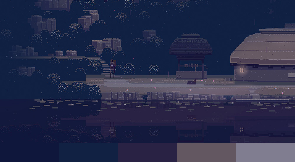
Color Palette
Despite the 8-bit art style being so interesting and beautiful to look at I was quite surprised when I found the color themes were actually extremely basic. Looking below, you can even see they’re, more or less, simply monochromatic. This isn’t a bad thing, of course, and find it quite interesting that such a beautiful piece was able to be accomplished with such limited color.
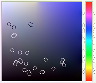 As I brought each into Photoshop I noticed the colors chosen completely ignore bright and saturated colors. In fact, if I bring up Adobe’s standard color picker and mash each color located below on to a single image, the color picker completely ignores the top right quadrant of the the color spectrum. Similar to Child Of Light, it seems this game likes the color balance to stay mute and dull. As you can see to the right, however, they had no problem changing the hue.
Music
The music was written by Jim Guthrie, a composer who continues to work with Capy on their next game Below. The soundtrack also comes with your purchase of the game.
The soundtrack combines an interesting taste and mixture of classic instruments with electronic. It’s not unusual to hear an acoustic guitar or a flute playing along with what sounds like a dark electric organ and, while this description sounds quite strange, I promise you the music sounds amazing!
 Jim Guthrie also has a cameo in the game for a brief moment and offers to play you a song if you’d like to sit down and listen. The song he plays is entitled And We Got Older and begins softly with just him on guitar. As the song progresses it soon introduces a cello followed by drums and some violin as accompaniment. If one clicks a few of the glowing trees and bushes near by you soon realize each emanates a tone to the key of his song and you quickly realize you can play along with him.
After this experience you only have a chance to see Jim once more in the game.
After listening to the soundtrack I can’t help but feel it’s extremely similar to the soundtrack of Tron (2010). The orchestration was a collaboration between Hans Zimmer and Daft Punk bringing you a mixture of classic symphony tied with modern electronica. It also had the same vibe and feel though the Tron soundtrack, as I’m sure you know, is much grander and bigger. It is an entire orchestra, afterall.
Related Games
 Super Time Force Ultra is Capy’s latest game which uses the same pixel style Superbrothers did. With that said the gameplay involves much more action and button pushing than Superbrothers and works at a much faster pace. At the moment it’s only out for Xbox but it’s been said to release on Steam this summer. Seeing as it’s currently summer it could be any time. Hopefully soon!
 Below is another Capy game who’s gameplay sounds similar to Superbrothers. While the release date hasn’t been announced yet it’s been stated you’re a “tiny warrior exploring the depths of a remote island.” This game also continues to use Jim Guthrie as the composer which makes me all kinds of happy. If the soundtrack is anything like Superbrothers I know I’ll love it!
 Fez is another pixel styled game who is slowly discovering the 3rd dimension. While having grown up in the 2nd dimension it’s brought to his attention there’s another dimension available to him and begins discovering new worlds. Each world has it’s own set of 8-bit themed music and will force you to think about solving puzzles in a new way. Definitely recommended!
Conclusion
Superbrothers: Sword & Sworcery is a highly recommended game for those that like slow-moving puzzle games and appreciate pixel based art. Truth be told the art of this game dramatically increases the value and would be far less substantial if it were to be replaced with a different style. I’d also suggest playing the game on a computer as I feel the mobile device misses out on a couple important features. It should definitely be appreciated on a larger screen and the music by larger speakers.
Also Check Out: Child Of Light Design Analysis