Design Systems VAlue
Why build design systems?
A Parable
Imagine you’re the only designer at a company building a task management application. Your goal is to enable a user to create their daily to-do list and remove tasks as they are accomplished. You design a single page to communicate the tasks, buttons to add, edit, and delete tasks, and a text field where one can add the name and content for each task.
As a single designer working on a single-page application, this works great. If a stakeholder on the project asks you to change the style of a button, there are only three of them so it’s no big deal to make that modification three times. No components or a design system are necessary.
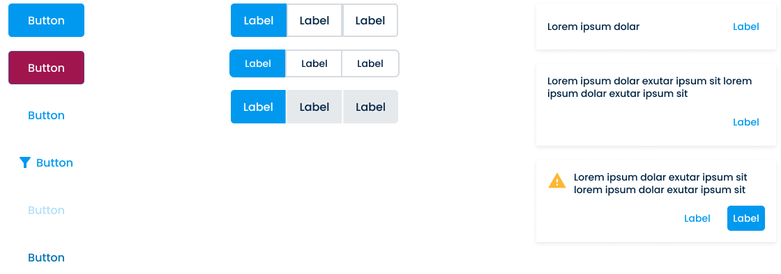
Well, during your discovery with your users, it turns out that people don’t typically only have one task at a time. The average amount of tasks your users have at any moment ends up being around 10 at a time. You want your prototype to mimic the average user so you add nine more tasks. Unfortunately, your application went from 3 buttons to 30 buttons. Now when a stakeholder asks you to change the style of a button, you have to do it 30 times. To solve this, you create a Button component. Now you can scale your design without introducing quantity as an element of friction.

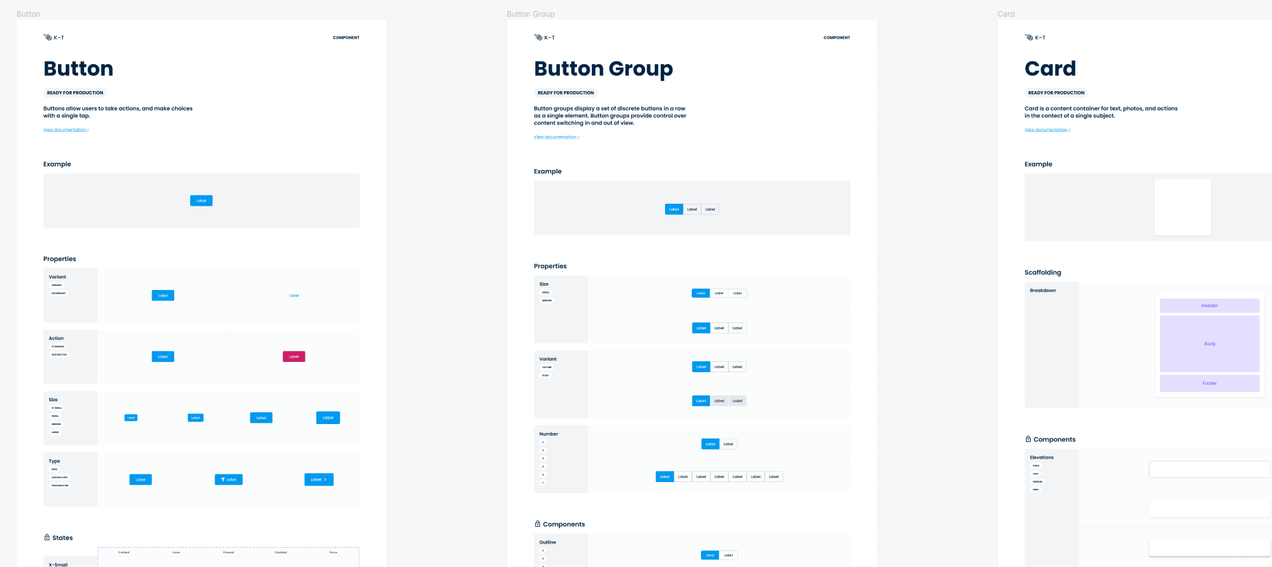
The application continues to grow. Now users want the ability to see all the tasks associated with previous days and want the ability to have their repetitive daily tasks automatically added to each day. Your app goes from a single page to multiple pages to accommodate these changes. Now you have button components, card components, and icon components enabling you to quickly modify all pages quickly. As more components are created, you end up creating a Component Library to store them all in one place. Any time you need to make a modification to the style or structure of the application, you can often just go to the component library and make the adjustments globally.

A year goes by and your team has grown. Now you’re one of three UX designers all working on the same application. Your Component Library now has 30 components for all kinds of unique elements of your application including modals, accordions, panels, colors, input fields, and banners.
However, most of these components weren’t made by you and you find yourself confused. What is the purpose of banners and how does it differ from modals? When should I use one color over another color? How are the users being trained to interact with these UIs?
Your team now has several hurdles:
- The use of each component isn’t communicated.
- The team isn’t aware of how different problems are being solved.
- The users are potentially being trained to interact with your UI in conflicting ways.
- The component library is becoming a friction point for quickly designing.
- The more designers that are added, the more technical debt the component library gains.
This is the point where a design system comes into play. Design systems enable a team to resolve the above hurdles and enable the team to scale. However, design systems also come with weight and maintenance. It will continue to evolve, update, and get heavier as the application and team grows. Furthermore, it requires the team to ask more philosophical questions and forces the team to build a systematic UI, one that follows rules and stylistic structures.
All of this assists in designers building software faster and enabling scalability.

One final note, folks like to either use the terms ‘component library’ and ‘design system’ interchangeably or skip the component library step entirely. The problem is design systems are commitments. There is absolutely no need to build out an entire system that an application doesn’t currently use or need.
Despite common rhetoric, I would highly encourage you to stay away from a design system until your component library starts holding you back. When that occurs, start building systems only in places you currently need them. You will find your component library will naturally evolve into a design system organically.
